


Message Dialog

Creating the Dialog
Create a Message Dialog by calling dialog.messageDialog with the three required and two optional arguments shown in the following table.| Argument |
Data type/notes |
| self |
the window (background) that is the parent
for the dialog |
| title |
quoted string displayed in title bar of
dialog |
| message |
quoted string displayed as the message in the dialog |
| OPTIONAL icon |
You may optionally include one of the defined
wxPython constants defining an icon to be displayed in the message dialog.
By default, PythonCard displays the "info" icon shown in the figure above.
See below for details. |
| OPTIONAL buttons |
You may optionally include one of the defined exPython
constants defining one or more button names to be displayed in the Message
dialog. By default, PythonCard displays the "OK" and "Cancel" buttons shown
in the figure above. See below for details. |
Example:
Above dialog was created with this line of code:
result = dialog.messageDialog(self, 'a message', 'a title')To add an icon other than the default "info" icon to the Message Dialog, provide the fourth argument, which can be any of the values shown in the following table:
| Constant |
Description of Icon |
| ICON_EXCLAMATION |
Exclamation point |
| ICON_HAND |
Hand, or error, icon |
| ICON_ERROR |
Same as ICON_HAND |
| ICON_QUESTION |
Question mark |
| ICON_INFORMATION |
Small "i" icon, the default icon |
Note that there are user interface guidelines for the appropriate use of these icons. It is generally a good idea to use them in the standard ways users expect to encounter them.
You can also cause the Message Dialog to display buttons labeled other than "OK" and "Cancel" by providing one of the constants in the following table as the optional fifth argument to the dialog.messageDialog method:
| Constant |
Button Labels |
| BUTTON_OK |
OK Button |
| BUTTON_CANCEL |
Cancel Button |
| BUTTON_YES_NO |
Two buttons, one labeled "Yes" and the other labeled
"No" |
| BUTTON_YES_DEFAULT |
If you supply BUTTON_YES_NO as the button constant,
you can optionally include this constant to cause the "Yes" button to be the
default button. Since "Yes" is always the default button unless you change
it, this constant is probably not of much use. |
| BUTTON_NO_DEFAULT |
If you supply BUTTON_YES_NO as the button constant,
you can optionally include this constant to cause the "No" button to be the
default button. |
Interacting With the Dialog
The messageDialog component returns two values, stored as elements of the Python dictionary called "results" returned by all PythonCard dialogs. These results are as shown in the following table.| Name of value |
Description |
| accepted |
1 = user clicked OK 0 = user clicked Cancel |
| selection |
string containing 'Ok' or 'Cancel' reflecting
which button the user clicked to dismiss the Message dialog |
Example:
The sample dialog shown at the top of this page returns the following results:
accepted: 1
returned: Ok
������������������������������������������������������������������������������������������PythonCardPrototype-0.7.3.1/docs/html/dialogs/multiplechoicedialog.html�����������������������������0100644�0000765�0000024�00000006315�07523020030�025247� 0����������������������������������������������������������������������������������������������������ustar �altis���������������������������staff������������������������������������������������������������������������������������������������������������������������������������������������������������������������������������������������������������������
Multiple Choice Dialog

Creating the Dialog
Create a Multiple Choice Dialog by calling dialog.multipleChoiceDialog with the four arguments shown in the following table.| Argument |
Data type/notes |
| self |
the window (background) that is the parent for
the dialog |
| title |
string to be displayed in the title bar of the
dialog |
| message |
string to be displayed inside the dialog as
a prompt for the user |
| choices |
list of strings containing the choices to be presented
to the user |
Example:
Above dialog was created with this line of code:
result = dialog.multipleChoiceDialog(self, "title", "message",
['one', 'two', 'three'])Interacting With the Dialog
The multipleChoiceDialog component returns two values, stored as elements of the Python dictionary called "results" returned by all PythonCard dialogs. These results are as shown in the following table.| Name of value |
Description |
| accepted |
1 = user clicked OK 0 = user clicked Cancel |
| selection |
list of strings containing the optoins
chosen by the user. |
Example:
The sample dialog shown at the top of this page returns the following results:
accepted: 1
Selection: ('one', 'three')
�������������������������������������������������������������������������������������������������������������������������������������������������������������������������������������������������������������������������������������������������������������������������������������������������������������������PythonCardPrototype-0.7.3.1/docs/html/dialogs/navigator.html����������������������������������������0100644�0000765�0000024�00000002221�07523020030�023043� 0����������������������������������������������������������������������������������������������������ustar �altis���������������������������staff������������������������������������������������������������������������������������������������������������������������������������������������������������������������������������������������������������������
PythonCard Dialogs
Common Dialogs and Their Use
General NotesAlert
Color
Directory
File
Find
Font
Message
Multiple Choice
Scrolled Message
Single Choice
Text Entry
�������������������������������������������������������������������������������������������������������������������������������������������������������������������������������������������������������������������������������������������������������������������������������������������������������������������������������������������������������������������������������PythonCardPrototype-0.7.3.1/docs/html/dialogs/scrolledmessagedialog.html����������������������������0100644�0000765�0000024�00000011167�07523020030�025416� 0����������������������������������������������������������������������������������������������������ustar �altis���������������������������staff������������������������������������������������������������������������������������������������������������������������������������������������������������������������������������������������������������������
Scrolled Message Dialog

Creating the Dialog
Create a Scrolled Message Dialog by calling dialog.scrolledMessageDialog with the three arguments shown in the following table.| Argument |
Data type/notes |
| self |
the window (background) that is the
parent for the dialog |
| message |
quoted string containing the text to
be displayed in the scrolling dialog by default |
| title |
quoted string containing the text to appear in the
dialog's title bar |
Most often, this dialog is used not with an explicit string passed as the second argument but rather with the contents of a file. The source code for this sample shows you how you can evaluate the third argument to the constructor method and, if it contains a valid file name, open that file and read its contents into the message variable for display.
Example:
Above dialog was created with this line of code:
result = dialog.scrolledMessageDialog(self, message, filename)In the sample code that launches and handles the above dialog, you will find the following lines of code which determine what will be displayed. Here, the name of the file "dialogs.py" is hard coded into the program for simplicity's sake but it is easy to see how you would handle the parsing of the file name in the first line of this fragment if it were supplied as a string in the third argument of the constructor, for example.
base, ext = os.path.splitext(os.path.split(sys.argv[0])[-1])
filename
= base + ".py"
if os.path.exists(filename):
f = open(filename, "r")
msg = f.read()
else:
msg = "Can't find the file dialogs.py"Interacting With the Dialog
You will not likely have much interaction with the scrolledMessageDialog component because it merely displays information to the user, supplies only an OK button, and returns no value in the result variable. It returns "accepted" but since there is no real difference between the user clicking the OK button (in which case accepted has a value of 1) or the window's close button (in which case accepted has a value of 0), it is of little value.Example:
The sample dialog shown at the top of this page returns the following results if the user clicks the "OK" button to dismiss it.
result:
accepted: 1
���������������������������������������������������������������������������������������������������������������������������������������������������������������������������������������������������������������������������������������������������������������������������������������������������������������������������������������������������������������������������������������������������������PythonCardPrototype-0.7.3.1/docs/html/dialogs/singlechoicedialog.html�������������������������������0100644�0000765�0000024�00000006535�07523020030�024701� 0����������������������������������������������������������������������������������������������������ustar �altis���������������������������staff������������������������������������������������������������������������������������������������������������������������������������������������������������������������������������������������������������������
Single Choice Dialog

Creating the Dialog
Create a Multiple Choice Dialog by calling dialog.multipleChoiceDialog with the arguments shown in the following table.| Argument |
Data type/notes |
| self |
the window (background) that is the parent
for the dialog |
| title |
quoted string displayed in title bar of dialog |
| message |
quoted string displayed inside dialog box as
prompt for user input |
| options |
list of values representing contents of dialog
choice list |
Example:
Above dialog was created with this line of code:
result = dialog.singleChoiceDialog(self, "title", "message",
['one', 'two', 'three'])
Interacting With the Dialog
The singleChoiceDialog component returns two values, stored as elements of the Python dictionary called "results" returned by all PythonCard dialogs. These results are as shown in the following table.| Name of value |
Description |
| accepted |
1 = user clicked OK 0 = user clicked Cancel |
| selection |
string containing the list element selected
by the user |
Example:
The sample dialog shown at the top of this page returns the following results:
accepted: 1
Selection: three
�������������������������������������������������������������������������������������������������������������������������������������������������������������������PythonCardPrototype-0.7.3.1/docs/html/dialogs/textentrydialog.html����������������������������������0100644�0000765�0000024�00000013415�07523020030�024306� 0����������������������������������������������������������������������������������������������������ustar �altis���������������������������staff������������������������������������������������������������������������������������������������������������������������������������������������������������������������������������������������������������������
Text Entry Dialog

Creating the Dialog
Create a Text Entry Dialog by calling dialog.textEntryDialog with the four required and one optional arguments shown in the following table.| Argument |
Data type/notes |
| self |
the window (background) that is the
parent for the dialog |
| title |
quoted string to be displayed in the
title bar of the Text Entry Dialog |
| prompt |
quoted string to be displayed inside the Text Entry
Dialog to prompt the user's reply |
| default |
quoted string to be displayed in the text field in
the Text Entry Dialog containing the response to be used if the user doesn't
change it. May be an empty string. |
| OPTIONAL field type |
The optional fifth argument to the constructor for
this dialog can contain one of two constants that affect the display of the
text field. If this argument is TEXT_PASSWORD, asterisks or bullets replace
the default text (if any) as well as the user's typing in the field. If this
argument is TEXT_MULTILINE, the field expands to accommodate multiple lines
of entry data. |
Example:
Above dialog was created with this line of code:
result =
dialog.textEntryDialog(self,
'A window title',
'What is your favorite language?',
'Python')Interacting With the Dialog
The textEntryDialog component returns three values, stored as elements of the Python dictionary called "results" returned by all PythonCard dialogs. These results are as shown in the following table.| Name of value |
Description |
| accepted |
1 = user clicked OK 0 = user clicked Cancel |
| returned |
String containing the label of the
button the user clicked |
| text |
String containing the text in the text entry field
of the dialog at the time the user clicked the button or closed the dialog |
Example:
The sample dialog shown at the top of this page returns the following results if the user doesn't change anything and clicks the "OK" button:
accepted: 1
returned: Ok
text: Python
���������������������������������������������������������������������������������������������������������������������������������������������������������������������������������������������������������������������������������������������������PythonCardPrototype-0.7.3.1/docs/html/documentation.html��������������������������������������������0100644�0000765�0000024�00000015302�10026174045�022314� 0����������������������������������������������������������������������������������������������������ustar �altis���������������������������staff������������������������������������������������������������������������������������������������������������������������������������������������������������������������������������������������������������������
Installation
The installation guide contains instructions for installing the latest versions of Python, wxPython, and PythonCard on Mac OS X (Jaguar), Linux, and Windows.Getting Started
- Getting Started in PythonCard by Dan Shafer
- Creating a Complete PythonCard Application from Scratch by Dan Shafer
- How to Add a Child Window to a PythonCard Application by David Primmer
- Increasing Usefulness with Timers and Threads by David McNab
- Building 'standalone' PythonCard applications by Phil Edwards
codeEditor screenshots and readme.txt
Shell usage and key bindings. The shell is a lot like the Python Shell used in IDLE and PythonWin.
PythonCard's resourceEditor: An Overview
Using the Power of findfiles in PythonCard
Creating and Interacting with Common Dialogs in PythonCard
Learning Python
We've put together a set of links to some of the best resources for learning Python. The material is suitable for both beginner and expert programmers, and includes reference material, code, and other links to the most popular Python community resources.State of the Framework
The following messages were originally posted to the PythonCard mailing list to document the state of the PythonCardPrototype framework in mid-October 2001. They were updated for release 0.6.5 on April 18th, 2002.- Components
- Resource Files
- Runtime Tools
- Menus and Dialogs
- General Concepts and Limitations
- Events and Handlers
Other Articles
Building GUI Applications With PythonCard And PyCrust by Patrick O'BrienMiscellaneous
There is additional information available on the PythonCard wiki about using CVS to get the latest version of PythonCard between releases, how to post bug reports, the Big To Do list, etc.
Create widgets and add event handlers at runtime. You can use this feature to create GUIs interactively using the PythonCard shell. You can also define the widgets in your layout dynamically in your program as shown by the dbBrowser sample.Revision History (Changelog)
The changelog.txt file documents the revision history of PythonCard. $Revision: 1.17 $, documentation updated on $Date: 2004/03/18 01:15:17 $PythonCard donations
PythonCard is free software. There is absolutely no obligation to pay any money to use or redistribute the software. However, the developers of the software consider the Python Software Foundation (PSF) a charity worthy of your support. A donation to the PSF would not only demonstrate your appreciation of this tool, but also help to advance the development of other Python-based open source tools in the future.
About the PSF
The PSF is a non-profit organization devoted to advancing the Python programming language. The PSF is a public charity under US tax law, and all donations made by US residents are tax deductible (see the PSF donations page for details).
For more information on the PSF, please see the PSF web site.
Why donate to the PSF?
PythonCard is written in the Python programming language. The developers of PythonCard believe that if it were not for Python, PythonCard would simply not exist - the productivity gains and ease of use made it possible for a bunch of hackers to experiment freely and somehow end up with this very nice tool.
In addition, the developers are all strong advocates of Open Source Software. It gives us powerful, free tools we can use to develop software, but more importantly, the tools come with the ultimate technical reference - the source code. Therefore, we are able to fully understand and sometimes even fix the tools we rely on.
Yeah yeah, but why donate to the PSF?
Many different people have donated their time to this project, which makes it unreasonable for any individual to collect money. As the PSF is a registered non-profit and devoted to promoting Open Source Software, it seems the logical choice.
What will the PSF do with my money? Will it be spent on PythonCard?
Your PythonCard donation goes into the general PSF fund; it is not earmarked specifically for the PythonCard project. In the future, the PSF may make additional funds available for PythonCard, for some other worthy Open Source project, or for some other purpose within its charter.
Open Source has a great history of producing fine code, but less so when it comes to performing the kinds of research required for these kinds of projects (research on statistical algorithms is time-consuming and tedious, and there's no a priori guarantee of success). One thing the PSF hopes to do in coming years is fund the core research needed to springboard these kinds of projects.
You may like to read the PSF Mission Statement for more details.
OK, OK, where do I pay?
Please make sure you have read this document, so you know exactly why you are giving money ('cos the software is so cool) and to whom (the PSF).
To donate now using PayPal, simply click here
����������������������������������������������������������������������������������������������������������������������������������������PythonCardPrototype-0.7.3.1/docs/html/faq.html������������������������������������������������������0100644�0000765�0000024�00000006314�07706044771�020232� 0����������������������������������������������������������������������������������������������������ustar �altis���������������������������staff������������������������������������������������������������������������������������������������������������������������������������������������������������������������������������������������������������������PythonCard FAQ (Frequently Asked Questions) Q. What is PythonCard? A. PythonCard is designed to be an application development framework for use by everybody. Its purpose and goal is ease of use and increasing productivity. From the first time developer to the veteran coder who knows a dozen languages, PythonCard is designed to allow you to quickly and easily design and build fully functioning applications with a graphical user interface. Q. What is the similarity between PythonCard and HyperCard? A. The PythonCard project is using HyperCard for inspiration. The first goal is to produce a framework. We already have runtime tools (Message Watcher, Property Editor, Shell) and a layout editor (resourceEditor sample), but we don't have an environment yet. You can use the resourceEditor sample to build layouts for your applications. Q. Have any programs been written with PythonCard? A. Yes. For a list of the samples that have been built with PythonCard and some screenshots of them in action go to: http://pythoncard.sourceforge.net/samples/samples.html A description of each sample is included in the readme.txt file in each sample directory. Q. Do I need to know Python to use PythonCard? A. Yes. We've added a Learning Python page to get you started. Q. What do I need to use PythonCard? A. Python 2.2.1 or higher and wxPython 2.4.1.2 or higher. Q. What Operating Systems are supported? A. PythonCard runs on every platform that both Python and wxPython are available for. This includes Windows 95/98/ME/NT/2000/XP, Mac OS X, Linux GTK, and Solaris Q. Does PythonCard run on Macintosh OS X? A. Yes. There are still display issues and other bugs, but it does work. The following wiki page has more info: http://wiki.wxpython.org/index.cgi/wxPythonOSX_20Issues You should also join the wxpython-mac mailing list http://www.wxpython.org/maillist.php Q. Can I build standalone executables? A. Yes, using py2exe and Gordon McMillan's installer. The minimalStandalone sample includes example scripts for both. Q. Where is the home page? A. http://pythoncard.sourceforge.net/ Q. Where can I download PythonCard? A. http://sourceforge.net/project/showfiles.php?group_id=19015 Q. Where is the mailing list? A. http://lists.sourceforge.net/lists/listinfo/pythoncard-users Q. Where is the CVS? A. http://sourceforge.net/cvs/?group_id=19015 --------------------------------------------------------------- Revision: $Revision: 1.8 $ Date: $Date: 2003/07/18 19:26:49 $
Using the Power of findfiles in PythonCard
One of the most powerful tools in the PythonCard scripter's arsenal is also one of the easiest to overlook. Its innocuous name gives the impression that findfiles is a utility similar to what one would expect in a file finding utility at the operating system level. And while it does bear some strong resemblance to such programs, findfiles in PythonCard is much more than a simple file locator utility.
Very often when you are programming in any programming or scripting language, you want to find out how a particular function works or whether a particular property is settable, or any of a number of other questions. In many cases, you can find the answers to your questions by looking at the source code of the application or tool you're using. This is sometimes referred to as "code shopping," particularly when what you really hope to find is a method that does exactly what you want to do.
The PythonCard findfiles tool is designed to support you in these efforts.
Type in a string for which to search, tell findfiles the directories (yes, you can have more than one) in which to search for files containing that string, and send findfiles off to locate Python files with that specific content. Scroll through the list of files, each with a line reproducing part of the located line for each occurrence in the file, find the one you think is what you are looking for, and double-click the line. Voila! Either codeEditor or textEditor -- two other useful PythonCard utilities -- opens and scrolls instantly to the line you've selected.
This document describes how to use findfiles and provides some getting-started tips as well as some ideas you'll find useful as you come to rely more and more on this handy little application, as we have.
Getting Started with findfiles
To start using findfiles, first launch the application (it's in the PythonCardPrototype/tools/findfiles directory). You'll be greeted with a window that looks something like Figure 1, though its size will probably be different.
Figure 1. Opening Default Window in findfiles
Now click on the "Add Dirs" button and navigate to your PythonCard Prototype directory. Figure 2 shows approximately what your findfiles window should look like after you've done these steps.

Figure 2. Initial Setup for findfiles Window
Now go to the File menu and select "Save As..." and save the search configuration you've just created as PythonCardPrototype.grep". You'll want to be sure this file is in the same directory as the findfiles.py file you launched.
OK, now you can type in any search term you'd like findfiles to locate in any of the files stored in the PythonCardPrototype directory or any of its sub-directories. Let's start with a simple example. Let's say you want to see how a "choice" component is used in PythonCard samples. Type the word "choice" into the "Search for" field and click on "Search." After a very brief pause (findfiles is quite fast), you should be looking at a window something like Figure 3.

Figure 3. findfiles Window After Searching for "choice"
Notice that the result is an indented list. At the left margin is the complete path to the file in which the "hit" is located. Indented under that file name is a set of one or more rows showing the line number in that file where the targeted string was found, and displaying the line in question.
Select any of these lines. We chose line 82 in the first file above, "SourceForgeTracker.py" but you can choose any line in any file you like. When you either click on the "Open Selected File" button or double-click on the line, the PythonCard codeEditor launches if it isn't running, opens the target file, and scrolls to the line number in question, as you can see in Figure 4.

Figure 4. PythonCard codeEditor Open to Selected Line
If you point findfiles at text files rather than Python or PythonCard code files, then double-clicking the line in the results list or selecting a line and clicking on the "Open Selected File" button will launch the PythonCard textEditor rather than codeEditor. Otherwise, the behavior is identical.
Essentially, this is all there is to using findfiles. You point it at one or more directories, tell it what types of files to search for, give it a string to look for in those files, and let it go off and find those files for you. When you identify a file and line that are promising prospects for telling you what you want to know, double-click on the line in findfiles or select the line and click on "Open Selected File" and codeEditor opens on that file, scrolling to the found line.
We have three remaining topics of potential interest to discuss: special character in search strings, saving and using GREP files and using more sophisticated search strings.
Special Character Usage in findfiles
As you've no doubt surmised by now, findfiles uses classic Unix grep (regular expression) searches. If you know grep, that's probably all we need to say here. If, however, you have no clue why you should care about grep, read on.The grep utility uses a technique called regular expression matching to locate information. In regular expressions, some characters have a special meaning. If you want to search for any of these special characters in the strings you supply in findfiles, you'll have to escape them by preceding them with a backward slash (\) character.
While there are many such characters in regular expressions, the ones with which you will need to be most careful are: question mark (?), asterisk (*), addition/concatenation operator (+), pipe or vertical bar (|), caret (^) and dollar sign ($). To search for a dollar sign in the target directories, for example, put "\$" into the search field. (Putting in a $ by itself will crash findfiles fairly reliably.)
Saving and Using grep Files
As you saw earlier when we walked through how to set up findfiles the first time you use it, you can define search parameters and then save them in a file which you can later load to re-run the same search. These files end with the suffix ".grep" and are saved in the same directory as the findfiles.py file.We have set up several commonly used search patterns that include various combinations of directories to search and terms for which to search. For example, we quite often want to find stuff in the wxPython files since PythonCard relies heavily on wxPython for its GUI components. So we have defined one file that has nothing in the search field but has a pointer to the wxPython directory in the directories list. Another common use for this capability is to create a directory entry that points to your own source code files for your project(s).
A slightly more complex example is shown in Figure 5. There, I've defined a search that looks only in the directory where I keep my personal projects, and the search term "def." This enables me to obtain quickly a list of all the functions I've defined in my projects.

Figure 5. Sample findfiles Search Through Personal Projects for Methods
I save this file as "myproject_methods.grep" and load it whenever I need to repeat the search. Using pre-stored search patterns like this, combined with the fast execution of the find process itself, makes using findfiles a very powerful addition to your PythonCard development tool arsenal.
$Revision: 1.3 $, documentation updated on $Date: 2002/06/04 17:37:33 $
| |||
|
Latest release: 0.7.3
|
|
$Revision: 1.59 $ : $Author: kasplat $ : Last updated $Date: 2004/03/23 20:48:27 $ ������������������������������������������������������������������������������������������������������������������������������������������������������������������������������������������������������������������PythonCardPrototype-0.7.3.1/docs/html/installation.html���������������������������������������������0100644�0000765�0000024�00000001650�10034104630�022135� 0����������������������������������������������������������������������������������������������������ustar �altis���������������������������staff������������������������������������������������������������������������������������������������������������������������������������������������������������������������������������������������������������������
Installing PythonCard
$Revision: 1.16 $, documentation updated on $Date: 2004/04/04 22:18:00 $
PythonCard Layout Editor and Runtime Tools

The resourceEditor sample is used to create and modify layouts and menus of PythonCard apps. In the screenshot above, the layout of Addresses sample is being edited.
Runtime tools

Message Watcher

Namespace Viewer

Property Editor

Shell
Where to Learn About Python
Learn Python
- Learning to Program - Python book for first-time programmers
- How to Think Like a Computer Scientist - Python book for CS majors
- Dive Into Python - Python for experienced programmers
- Introductions - Python articles for beginners and experts
- Python Books - commercial Python books for sale
- Non-English resources - tutorials in over a dozen languages
- more FAQs, help, and tutorials
Python Reference
- Reference - official Python documentation
- Quick Reference - all essential Python syntax
- FAQ Wizard
Python Community
- Python.org - Python home page
- comp.lang.python - lively discussion of all things Python
- comp.lang.python.announce - announcements of new and updated software, books, and other resources
- Tutor - mailing list for beginners
- Python mailing lists - e-mail discussions of specific Python topics
- Python mailing lists archive at ASPN - searchable archive
- more links
Python Code
- Python Cookbook - useful recipes
- Vaults of Parnassus - central repository for 3rd party Python software
- Python.faqts - community-maintained knowledge base
- Useless Python - code samples for beginners
$Revision: 1.11 $, documentation updated on $Date: 2004/03/04 00:50:31 $
More Applications Built With PythonCard
Name: PIMP: Photographic Image Management Package
Description: PIMP is software to allow digicam images to be stored in a simple database for easy management.
URL: http://www.linux2000.com/pimp.html

Name: McPC
Description: McPC is a PythonCard front end for the McMillan Installer.
URL: http://members.iinet.net.au/~lawrieabbott/distractions.html#mcpc

Name: RanchBiz - A PythonCard/PySQLite application
Description: RanchBiz was created to manage some parts of guest registration for a guest ranch.
URL: http://www3.telus.net/public/wexsessa/RanchBiz/

$Revision: 1.4 $, documentation updated on $Date: 2004/03/22 22:26:00 $
Latest release: tba
Statement of Requirements
Items in italics are still to be decided. The first version of Pythoncard will support;
Static Text
Sometimes known as labels or boilerplate.
Fields
Single and multi-line fields for text entry. They will support tab-order between fields (TabOrder, TabIndex properties).Can styled text be supported without complicating the interface and code?
Can we get scrolling text fields with scrollbars "for free"?
Buttons
Standard
Radio
Radio button groups
Optional for first releaseBitmap Buttons
Optional for first releaseData Entry widgets
Checkbox
Support for tab-order integrated with field tab order if possibleListbox
Scrolling text list. Optional for first releaseCombobox
Drop-down menu list. Optional for first releaseStatic bitmap
Which formats should be supported(GIF, JPG, BMP, PNG)?Menus
File
Exit, Open, Save.Edit
Cut, Copy, Paste for fields.About
User-defined menus/menu items that are bound to commands. Could be a sub-menu from help.Help
Links to help (in HTML format) and version information.Common dialogs
- File Open/Save
- Message (About)
- Choice (Yes/No, Ok/Cancel)
- Text entry choice (single field plus Ok/Cancel)
Miscellaneous
The following items are notes and placeholders for future consideration that don't fit easily into any of the earlier categories.- Clipboard support for textual data (Cut/Copy/Paste).
- Overlapping buttons, fields, bitmaps will probably look messy at best until layering is available, so avoid rect of objects overlapping.
- All the widgets should receive and be able to respond to events like: click (mouseDown), double-click, mouseOver, keyPress, closeField [need to complete this list for each widget type)
- All widget descriptions to be stored in an external resource file.
- Initially, the layout might be handled by a variety of programs such as Boa, wxDesigner, Glade, and then scripts in Python can translate the resulting output files to our own description format. The format should be text to allow easy editing of widget properties.
- Fixed pixel-based widget positions
- Single layer, unless multi-layer doesn't complicate framework too much
- Single card/stack, so no multi-stack issues, messaging between stacks, etc.
- Some kind of idle event so object scripts don't have to block. The simple example would be that the card object catches the idle event once a second and calls a method to update a label/field/button with the current time.
- Don't monopolize the CPU.
- No printing.
- Minimum of one resizable window with initial size defined in the resource file.
- Offscreen buffering of window contents if necessary to preserve contents when window is obscured, minimized, etc.
- Support scrolling of window contents if possible
- openCard, closeCard, nextCard, previousCard events can be generated, but no persistent data store, so the card class will need to be overridden to support record-level read/write. Those routines will also need to call methods to clear all fields, reset buttons, and load fields with data.
- Objects should be able to call existing Python modules.
$Revision: 1.3 $ : $Author: kasplat $ : Last updated $Date: 2002/02/07 23:48:27 $
Meet the resourceEditor
Scope and Purpose
This document describes the resourceEditor which is used to design, lay out, and manipulate PythonCard applications' graphical components. It is current as of Version 0.6.7 of the PythonCard release, but given the state of flux in which PythonCard finds itself, you should expect the behavior of the resourceEditor to change between now and the 1.0 release of the product.This document is not so much about how to use the resourceEditor as it is an operational reference overview of the functionality it contains. The walkthroughs that constitute the primary tutorials for PythonCard developers provide step-by-step instructions for using the resourceEditor to construct applications and are therefore closer to what you would consider a tutorial.
For the most part, this discussion confines itself to the use of the resourceEditor in building applications on Windows platforms designed to run on Windows platforms. But PythonCard can be used on *nix systems and a version for Macintosh OS X is in beta test as this is being written. Applications written in PythonCard will be able to run on all of those systems unchanged once the deployment of wxPython (the cross-platform windowing toolkit on which PythonCard is based) is complete on all of those platforms.
Overview of resourceEditor
The resourceEditor is located in the tools directory of the PythonCard distribution.The resourceEditor is the most common starting point for constructing a PythonCard application. Using this tool, you can create, position, size, describe and connect not only your application's windows and all of the components they contain (buttons, fields, and other controls), but also its menus and supporting dialogs. A direct-manipulation interface enables you to create, drag, and size window components in the grand tradition of Integrated Development Environments (IDEs). The resourceEditor also incorporates a menu editor and a background editor for managing the non-component portions of your PythonCard's application.
Scripting is not integrated into the resourceEditor. Instead, we allow you to choose your favorite Python script editor to write the code that gives your application its intelligence and behavior. (We would recommend you look at the codeEditor sample application that comes with PythonCard. It is a very capable Python-aware editor and its source is available so you can change it to suit your tastes.)
The 10,000-Foot View of PythonCard Application Development
All PythonCard applications have at least two basic files.One file, which has a double file extension of ".rsrc.py" and is referred to as the "resource file", describes the user interface elements. It is a text file containing a Python dictionary object, which PythonCard parses and uses to create the user interface for your application at both design time and runtime. This file, being a standard Python code file, can be edited in any text editor to modify the user interface. As a rule, you will only do this if you need to add a component to the interface which is not directly supported by PythonCard. For most purposes, it is best to allow the resourceEditor to manage the contents of the resource file.
The second file is a standard Python script file ending with the extension .py (or .pyw depending on how you want it executed). It contains the code your application executes. This code of event-triggered methods and commands that will be executed as the user interacts with your PythonCard application.
Of course, any PythonCard application may contain multiple script files and, if it contains multiple windows or if it uses dialogs, may also have more than one resource file. In addition, data and configuration files may also be part of the application. This document, however, focuses on the resource file, only describing the script file where necessary to explain the resourceEditor's functionality.
It may not be entirely obvious why we would divide a PythonCard application into two files. This approach was popularized by Apple's Macintosh system, which actually used only one file for a typical application but divided that file into two parts which were managed separately. One contained the application code itself and the other contained information about the resources the application used for its user interface. PythonCard, which has some roots in a famous Apple Computer product called HyperCard, adopted this strategy of separating layout from executable source code. Doing so allows PythonCard developers, e.g., to change the layout of an application without even examining, let alone understanding and editing, source code for the application. This design also facilitates internationalization and other stylistic changes that a designer or other non-programming user can make without touching the rather more complicated source code that gives the application its behavior.
Basic Development Process
The typical process for developing a PythonCard application involves the following steps.- Decide whether to start with an existing application or sample or to begin with a built-in application template.
- Make a copy of the starting point if you're using one.
- Launch resourceEditor and open the resource file for the starting point if you're using one.
- Add, delete, rename, reposition, and otherwise manipulate the visible components of the interface.
- Edit the background properties that describe the window itself.
- Edit the menu(s) to be included in the application, if any.
- Connect menus and components to their behavioral code to be stored in the Python script file for the application.
The first three steps are described in each of the walkthroughs that make up the primary tutorials for PythonCard, so we won't repeat them here except to say that you launch resourceEditor the same way you launch any other Python application on your system.
Before we look into the remaining steps and how they are carried out in the resourceEditor, let's look at all of the windows that comprise the resourceEditor.
The resourceEditor's User Interface
In its default configuration "out of the box," the resourceEditor, when you launch it, will open three windows plus a console window. The three windows are:- the Template Resource window (see Figure 1), which is the default window in which you will begin constructing your UI unless you elect to open an existing resource file
- the Property Editor window (Figure 2), where you will manipulate such things as fonts, colors, sizes, positions, labels, names, and other details describing each component you add to the application's window
- the read-only Position & Size window (Figure 3) which you can use to assist you in placing components in the window

Figure 1. Default Resource Window in resourceEditor

Figure 2. Blank Property Editor Window (No Component Selected)

Figure 3. Blank Position & Size Window (No Component Selected)
When you wish to edit elements of the user interface for which the resourceEditor does not automatically open a window, you will encounter two other windows: the menu editor and the background editor, shown, respectively, in Figures 4 and 5.

Figure 4. Background Info Editor Window

Figure 5. Menu Editor Window
Using a Built-In PythonCard Template
The File menu in the resourceEditor's resource window contains a "New..." item that, when selected, produces a dialog box like the one shown in Figure 6. From this list, which will likely grow before the official release of PythonCard 1.0, you can choose one of four basic templates for creating a PythonCard application.
Figure 6. Dialog for Selecting Built-In Templates as Starting Point for New Applilcation
Managing User Interface Components
Once you have a window open in the resourceEditor, you can add components to it, select existing components and manipulate or edit them, and otherwise use components to build a PythonCard application's GUI.To add a component to the window, select it from the Component menu in the resourceEditor. Figure 7 shows the menu open so that you can see the components supported in this release. All of these components are inherited from wxPython.

Figure 7. Component Menu in Resource Window
When you select a component type, a new instance of that component gets placed in the window in the upper left corner. It is selected so that its properties are immediately available for editing in the Property Editor window and its size and position are reflected in the Size & Position window. Figure 8 shows a button placed in the window, while Figure 9 shows the Property Editor window's contents immediately after the initial placement of the button and Figure 10 shows the Size & Position window's contents at the same time.

Figure 8. New Button Placed in Resource Editor Window

Figure 9. Property Editor Window on Newly Placed Button

Figure 10. Position & Size Window on Newly Placed Button

Figure 11. Property Editor Window Preparing to Edit Font of Selected Button
Each component has a set of properties, some of which are shared with all or some other components and some of which may be unique to the specific component. These properties are delineated in the soon-to-be-published PythonCard Component Description document.
The Size & Position Window displays those parameters for the selected window in your application or for the selected component in the window, but its contents are not editable. To change those properties, you must either directly manipulate the component or edit the appropriate property.
Managing Background Properties
Every window in a PythonCard application automatically includes a background. This background describes the characteristics of the window as a whole, and acts as the backdrop against which components are placed and which is the container of those components.As we saw in Figure 4, above, you can modify the properties of the application windows' backgrounds using the Background Information Editor, which is displayed by selecting "Background Info..." from the resourceEditor's "Edit" menu.
You will want to change the background's name to something that reflects your application's name if for no other reason than it will be easier to remember its name when you refer to it in your Python scripts. The Title field should contain the text you want to display as the window's title in its title bar.
The position and size settings are the default values. When the window opens, it will open at that location on the screen and at the indicated size. You'll find that if you resize the window and move it around on the screen, then reopen the Background Information Editor, it will update to reflect your changes.
(Note that in the current release of PythonCard, it is not possible to make a fixed-size window that the user cannot resize. When the user does resize a window, then exits the application, the windows will restore themselves to their default sizes and positions on restart unless you specifically write Python code to override those settings.)
You can alter the foreground and background colors of the window using standard color selector dialogs for your system. In this release, we recommend you not alter those properties if you intend to run your PythonCard application on other platforms because cross-platform color compatibility is still a bit shaky in wxPython. It is possible to give your window a graphic image as a background. If you check the "Tile" checkbox, the image will appear in its original size, tiled as needed to fill the background. If you do not check "Tile," the image will be stretched or collapsed to the size of the window.
If you wish to select an icon to represent your application when it is collapsed or in the launch area for the system on which it runs, identify the image file for the icon in the space provided. If you do not supply an icon, PythonCard uses the standard Python icon, a cute green snake.
The last two items you can control about a background are whether it displays a status bar (default is off) and whether it is visible when your application starts (default is on).
Once you make changes to the background, you should save your application's resource file.
Managing Menus
The PythonCard resourceEditor incorporates a full-featured menu editor that uses industry-standard terminology and allows you to define shortcuts and accelerator keys for all menu options. Figure 12 shows you what the Menu Editor looks like when it has a complex set of menus defined. (It actually depicts the menus in the resourceEditor itself.)
Figure 12. Menu Editor Showing Menus in resourceEditor's Resource File

Figure 13. Menu Editor Showing New Menu Being Defined
Similarly, you create new items to appear on menus by clicking the "New MenuItem" button in the Menu Editor. This creates a new menu item at the bottom of the current list of menus and menu items, as shown in Figure 14.

Figure 14. Menu Editor Showing New Menu Item Being Edited
In providing a label for a menu item (but not, of course, for a menu, which is not executable), you may select an accelerator key by preceding any letter in the label with an ampersand ("&"). Figure 15 shows an example of this using the menuFileOpen menu item. Notice the ampersand preceding the letter "O" in the menu item's label. This means the user can select the File Open option by typing Alt-F (to select the File menu) followed by Alt-O. Notice, too, that the Ctrl+O shortcut is also defined, allowing the user to open a resource file by typing Control-O. To enter a shortcut key combination, just press the keys you wish to use. PythonCard places a text represetation of the key combination in the field.

Figure 15. Menu Editor Showing Menu Item With Accelerator Key and Shortcut Defined
The final feature of the Menu Editor to note is the "Up" and "Down" buttons. Since new menus and menu items are always created at the bottom of the list of menus and menu items, we need some way to move them around to associate them with the appropriate menu and to arrange menus in the desired order. Selecting any menu or menu item and then clicking the "Up" and "Down" buttons moves the selected object in the list.
Note that if you wish to create a menu separator within a menu, simply create a new menu item and make its label a single hyphen. Leave all other characteristics of the menu item unchanged.
Creating and Editing Dialogs
You can also use the PythonCard resourceEditor to create dialogs to be used in your application. You create a new dialog by selecting the "New Dialog" option from the File menu. The resulting editor looks like Figure 16.
Figure 16. Editing Window for New Dialog
- Dialogs have no menus, so there is no menu editor.
- Dialogs have no backgrounds, so there is no background editor. (There is instead a Dialog Info... Window, shown in Figure 17, which presents a subset of a Background Editor containing only information pertinent to dialogs).

Figure 17. Dialog Information Editor Window
Connecting Components and Menus to Scripts
There are two ways to create a connection between an active component or menu item in your PythonCard application and the application's behavior as defined in your Python script file: events and commands. Since this document describes the resourceEditor and since scripting is conducted outside the resourceEditor, we will here consider only summarily the process by which these connections are made. For details and examples, see the tutorial walk-throughs, particularly the soon-to-be-published walkthrough3 and walkthrough4.Events
When the user activates a component in your PythonCard application, that action triggers an event. Your Python script consists principally of methods defining how to respond to user-triggered events. There is a one-to-one correspondence between the event that is triggered and the name of the method or handler your program calls in response to the action.For example, when the user clicks on a button, PythonCard generates a mouseClick event on that button. The full name of the event passed to your Python script in the case of a button-press looks like this: buttonSave_mouseClick (assuming the user has clicked on a button whose name is "buttonSave".) Note that it is the button's name, not its label that is used here. In your Python script, the handler that will be run when the user clicks on the Save button would begin with the following line of Python code:
on_buttonSave_mouseClick(self, event):
Your Python code would then go on to define what you wanted the application to do when the user clicks on the Save button. If there is no handler called on_buttonSave_mouseClick, then if the user clicks on the button named buttonSave, nothing will happen.
Similarly, if the user selects a menu item, the event triggered is called something like menuFileSave_selected and your handler for this event would start with a line of Python code like this:
on_menuFileSave_selected(self, event):
Commands
In situations where you want the same behavior to be carried out by more than one component and each of those components can trigger only one action, you can use a single PythonCard command in your script file and connect each component to it. This requires two steps: definition of the command in your Python script, and pointing the component to the command it is to execute when it is activated.Defining a command in your Python script simply requires following the definition convention of naming the command handler something like this:
on_editClear_command(self, event):

Figure 18. Connecting a Button to the editClear Command
Additional Features
This section describes three additional features of the resourceEditor:- testing your application from within the resourceEditor
- using a grid to align objects
- viewing the contents of the resource file itself
Testing Your Application
You can run your PythonCard application directly from resourceEditor. This results in a highly interactive, seamless development environment which will further accelerate the rapidity with which you can create Python applications using PythonCard as the GUI tool.Setting Up Runtime Options
Before you run your PythonCard application, you can set up some parameters
that determine the level of detail with which you can examine and interact
with the running application. From the File menu, choose "Run options..."
The dialog box shown in Figure 19 appears.
Figure 19. Run Options Dialog
None of these options "sticks" automatically. You can set up a configuration in which all of your options are remembered for all PythonCard applications you launch in the resourceEditor. We cover this option below. When you run the application outside the resourceEditor environment, these settings are ignored.
If you turn on logging, then run your application, PythonCard logs debugging information directly to the system console (referred to as "stdout" in programmer terminology). Optionally, you can instruct PythonCard to create a text file and route logging information to it. This file tracks debugging information about your application. A sample of this log file is shown in Figure 20 as it would appear if routed to a file called pythoncard.log. An explanation of the log is beyond the scope of this document.

Figure 20. Sample Debugging Log File

Figure 21. Message Watcher Window Showing Sample Message Information
If you turn on the Namespace Viewer, you'll see a window like the one in Figure 22 when you run your PythonCard application. This window shows in its left pane a complete tree of all of the objects and methods in the namespace in which your application is running. Selecting objects in that list -- which is a tree outline and therefore can expand and collapse as desired -- displays appropriate information about them in the right text pane.

Figure 22. Namespace Viewer Window With Representative Content
Changes you make in the runtime Property Editor are not preserved when you quit the application and return to the resourceEditor.
One of the most powerful things you can do when running a PythonCard application from inside the resourceEditor is to open the shell by selecting that option from the Run Options dialog. When you do this, the standard PythonCard shell window opens. As you can see in Figure 23, you can interact with your program from this shell, inspect settings and properties, etc. In the window shown in Figure 23, we've asked the background of our application for its name and for a list of the components it contains. The component list is a dictionary which can be quite revealing when you are trying to debug a difficult-to-locate error. You can also use the Shell to send messages to your application manually.

Figure 23. Shell Window Showing Interaction With Running Application
Debugging a Running PythonCard Application
You may have noticed if you've been running the resourceEditor and selecting the run options outlined above that you will often see a "Debug" menu in your application's menu bar (see Figure 24). Choosing any of the run options except logging will produce this menu when you run your application in the resourceEditor.While the options on this menu are largely self-explanatory, let's run through them so you'll be sure you know how to use this powerful feature of PythonCard's resourceEditor.

Figure 24. Debug Menu in Running PythonCard Application
"Redirect stdout to Shell" is a useful debugging tool. If your application generates errors, the only way to see and capture them is by examining the results sent by Python to a terminal window called stdout. But since that window isn't open when you are running in PythonCard, you need a way to handle this output. This menu option allows you to have these messages displayed in the PythonCard Shell. This implies, of course, that you'll want to be sure the Shell is open before you choose this option.
The "Save Configuration" option allows you to set up a standard configuration for running PythonCard applications. You use this feature as follows:
- Before running your PythonCard application, choose the debugging options you'd like to set up. For example, if you always want to run your PythonCard applications with the Message Watcher and the Shell available, choose those options in the Run Options dialog.
- Run your application. Position the debugging windows where you'd like them on the screen.
- From the Debug menu, choose "Save Configuration."
Note, however, that if you add new debugging windows to your running application by opening, say, the Namespace Viewer, and then save the configuration again, that window will not appear next time you launch a PythonCard application. You must set up the options before you run the application.
You may, of course, change this configuration any time simply by changing your Run Options, running your application, and then saving the configuration.
The next two menu items in the Debug menu launch your Web browser and take you to the PythonCard home and documentation pages, respectively.
The final option displays a dialog box which tells you the version of PythonCard you are running, the versions of all supporting programs that are installed with it, and pointers to other useful information.
Using the Grid
Like most IDEs, PythonCard's resourceEditor includes a grid capability. The grid can be turned on or off, its size altered, and objects made to adhere to it using choices on the Options menu. There are only two choices on this menu. The first allows you to set the size of the grid in pixels. The default setting is 5. A value of zero effectively turns off the grid. The second menu option makes the grid active or inactive. It is a toggle for which you can use Ctrl-G as the shortcut. If the grid is active, then when you move components around on the background of your PythonCard application, they move in increments the size of the grid. If it is off, you can place components anywhere you like.There is no way in the resourceEditor to cause existing objects to snap to a grid or to align with one another other than manually. If you have one or more components selected and choose to turn the grid on, the objects do not move, or "snap", to the grid. The grid only controls the parameters for your direct movement of components.
Viewing the Resource File
The View menu in the resourceEditor has toggle options to show and hide the Property Editor and the Position & Size Window. Its third item allows you to open and inspect but not edit the resource file for the open application. Selecting that menu option produces a window something like the one shown in Figure 25.
Figure 25. Resource Viewer
Note that although you cannot edit the resource file here, the resource file can be edited by any text editor (preferably a Python-aware editor). However, we strongly discourage direct editing of the resource file until you've had considerable experience with PythonCard and with editing Python dictionaries. If this file becomes disorganized, your PythonCard application may have to be built again from scratch.
Concluding Thoughts
There is obviously a lot of power and capability in the PythonCard resourceEditor. While we have tried to be thorough here, we have not been exhaustive. For example, each of the components you can place on the background has its set of properties. Dealing with multiple-window applications in the resourceEditor has also not been addressed here. You'll find that in soon-to-be-published walkthrough4 of our tutorial series when it is available.The resourceEditor's UI is built in resourceEditor. You can examine it and, of course, in the grand tradition of Open Source, you are free to modify it, add to its functionality, change labels on things, etc.
$Revision: 1.2 $, documentation updated on $Date: 2002/06/04 17:47:45 $
\n' max = len(SAMPLES) - 1 for i in range(len(SAMPLES)): name = SAMPLES[i] contents += '%s
\n' % (name, name) for i in range(len(SAMPLES)): name = SAMPLES[i] if name == 'samples': path = os.path.join(samplesDir, 'readme.txt') else: path = os.path.join(samplesDir, name, 'readme.txt') readme = readFile(path) html = html_template html = html.replace('[title]', name) if i == 0: previousSample = SAMPLES[-1] nextSample = SAMPLES[i + 1] elif i == max: previousSample = SAMPLES[i - 1] nextSample = SAMPLES[0] else: previousSample = SAMPLES[i - 1] nextSample = SAMPLES[i + 1] data = '' template = '' try: images = imageList.images[name] for i in range(len(images)): figure, url = images[i] if figure == '': figure = "Figure %d" % (i + 1) else: figure = "Figure %d: %s" % (i + 1, figure) if not url.startswith('http:'): url = imageList.BASE_IMAGE_URL + url template += '
\n' % (url, figure) except: pass html = html.replace('[contents]', contents) html = html.replace('[images]', template) html = html.replace('[previous_sample]', previousSample) html = html.replace('[next_sample]', nextSample) # using a slightly longer wrap hopefully # avoids problems when the readme.txt has its # own line feeds readme = expandUrls(util.wordwrap(readme, 86)) html = html.replace('[readme.txt]', readme) writeFile(name + '.html', html) #contents += '%s
\n' % (name, name) batch += UPLOAD_COMMAND % (name, name) i += 1 contents_template = contents_template.replace('[contents]', contents) writeFile('index.html', contents_template) batch += UPLOAD_COMMAND % ('index', 'index') writeFile('upload.bat', batch) if __name__ == '__main__': main() ��������������������������������������������������������������������������������������������������������������������������������������������������������������������������������������������������������������������������������������������������������������������������������������������������������������������������������������������������������������������������������������������������������������������PythonCardPrototype-0.7.3.1/docs/html/samples/imageList.py������������������������������������������0100644�0000765�0000024�00000007350�07606756217�022536� 0����������������������������������������������������������������������������������������������������ustar �altis���������������������������staff������������������������������������������������������������������������������������������������������������������������������������������������������������������������������������������������������������������ BASE_IMAGE_URL = 'http://pythoncard.sourceforge.net' # may need to expand the logic to support # a conditional smaller image for the main page # with a link to a larger image # perhaps just having an extra item in the list will work #['description', 'imageURL', 'optionalSmallImageURL'], # tools will probably have their own dir # but the images might be in the same list """ 'textEditor':[ ['A simple text editor', '/images/textEditor01.jpg'], ], """ images = { 'addresses':[ ['A direct port of the layout and data from the HyperCard Addresses stack', '/images/addresses_01.png'], ], 'chat':[ ['', '/images/chat_01.png'], ], 'codeEditor':[ ['Editing the minimal.py sample', '/images/codeEditor_01.png'], ['File Menu', '/images/codeEditorFileMenu.png'], ['Edit Menu', '/images/codeEditorEditMenu.png'], ['View Menu', '/images/codeEditorViewMenu.png',], ], 'companies':[ ['', '/images/companies_01.png'], ], 'conversions':[ ['', '/images/conversions_01.jpg'], ], 'custdb':[ ['', '/images/custdb_01.png'], ], 'dbBrowser':[ ['The initial login dialog', '/images/dbBrowser01.jpg'], ['A record from a MySQL database', '/images/dbBrowser02.jpg'], ], 'dialogs':[ ['', '/images/dialogs_01.png'], ['', '/images/test_dialogs_02.jpg'], ['', '/images/test_dialogs_03.jpg'], ], 'doodle':[ ['A simple bitmap drawing program', '/images/doodle01.jpg'], ], 'flatfileDatabase':[ ['', '/images/flatfileDatabase_01.png'], ], 'hopalong':[ ['', '/images/hopalong_02.jpg'], ], 'life':[ ['Main window', '/images/life_01.png'], ['Lexicon window', '/images/life_02.png'], ['Patterns window', '/images/life_03.png'], ], 'minimal':[ ['Windows', '/images/large/Minimal.gif'], ['Linux', '/images/snapminimal_01.png'], ], 'pictureViewer':[ ['', '/images/pictureViewer_01.png'], ], 'proof':[ ['Windows', '/images/large/Proof.gif'], ['Linux', '/images/snapproof_01.png'], ], 'pysshed':[ ['Session Manager', '/images/pysshed_01.jpg'], ['Session Defaults', '/images/pysshed_02.jpg'], ], 'radioclient':[ ['', '/images/radioclient_01.png'], ], 'redemo':[ ['', '/images/redemo_01.png'], ], 'rpn':[ ['', '/images/rpn_01.png'], ], 'samples':[ ['', '/images/large/SamplesLauncher.gif'], ], 'searchexplorer':[ ['', '/images/large/SearchExplorer.gif'], ], 'simpleBrowser':[ ['', '/images/simpleBrowser_01.png'], ], 'slideshow':[ ['', '/images/slideshow_01.png'], ], 'sounds':[ ['', '/images/large/Sounds.gif'], ], 'SourceForgeTracker':[ ['', '/images/SourceForgeTracker_01.jpg'], ], 'spirograph':[ ['', '/images/spirograph_01.png'], ], 'stockprice':[ ['', '/images/stockprice_01.png'], ], 'textIndexer':[ ["Dan Winkler's original test converted from tkinter", '/images/textIndexer01.jpg'], ], 'textRouter':[ ['', '/images/textRouter01.jpg'], ], 'tictactoe':[ ['Noughts and Crosses', '/images/tictactoe_01.jpg'], ], 'turtle':[ ['4bugs', '/images/turtle_4bugs_01.jpg'], ['3turtles', '/images/turtle_3turtles_01.jpg'], ['bytedesign', '/images/turtle_bytedesign_01.jpg'], ['pentest', '/images/turtle_pentest_01.jpg'], ['Manipulating the turtle from the shell', '/images/turtle_shell_01.jpg'], ], 'webgrabber':[ ['', '/images/webgrabber_01.png'], ], 'widgets':[ ['Windows', '/images/widgets_01.png'], ['Linux', '/images/snapwidgets_01.png'], ], 'worldclock':[ ['', '/images/large/WorldClock.jpg'], ], } ����������������������������������������������������������������������������������������������������������������������������������������������������������������������������������������������������������������������������������������������������������������������������������������PythonCardPrototype-0.7.3.1/docs/html/samples/templates/��������������������������������������������0040755�0000765�0000024�00000000000�10036262762�022226� 5����������������������������������������������������������������������������������������������������ustar �altis���������������������������staff������������������������������������������������������������������������������������������������������������������������������������������������������������������������������������������������������������������PythonCardPrototype-0.7.3.1/docs/html/samples/templates/contents_template.html����������������������0100644�0000765�0000024�00000001223�07600267503�026640� 0����������������������������������������������������������������������������������������������������ustar �altis���������������������������staff������������������������������������������������������������������������������������������������������������������������������������������������������������������������������������������������������������������
| |||
| |||
| [contents] |
|
Samples Screen Shots
Here are some pictures of the samples shipped with PythonCard. Click on any of the pictures to see a full size version.
You might also want to look at some screenshots of the Layout editor and runtime tools.
Note that the color of the windows below vary because they were captured on different machines
using different color schemes. This shows that PythonCard which relies on wxPython/wxWindows is using
native controls. There are some Linux screen shots will on the next samples page.
To download the framework and these applications go to the downloads section of the project site on Sourceforge
addresses

A direct port of the layout and data from the HyperCard Addresses stack.
conversions

The sample handles conversion from fahrenheit to celsius and english to morse code which is shown above. You can add
your own conversion classes.
dbBrowser
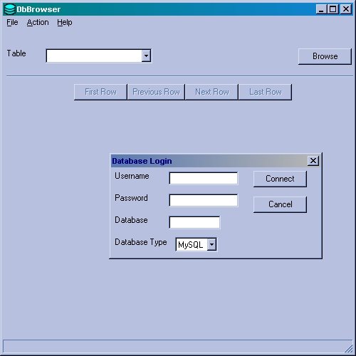
The initial login dialog.
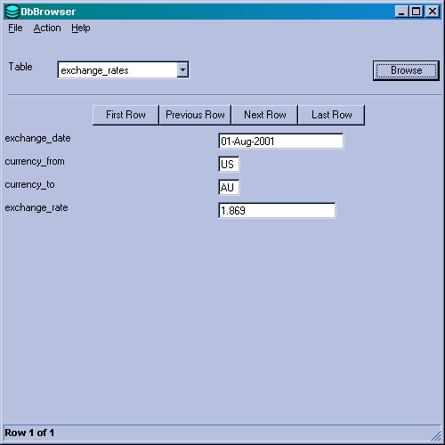
A record from a MySQL database.
dialogs

This application showcases all of the different dialogs that you can invoke easily and simply in PythonCard.
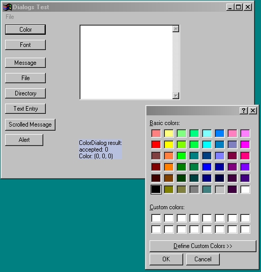
When you press the 'Color' button the standard color dialog pops up.
You can use this in your applications to enable users to customise the look and feel of the applications you develop - surprisingly enough.
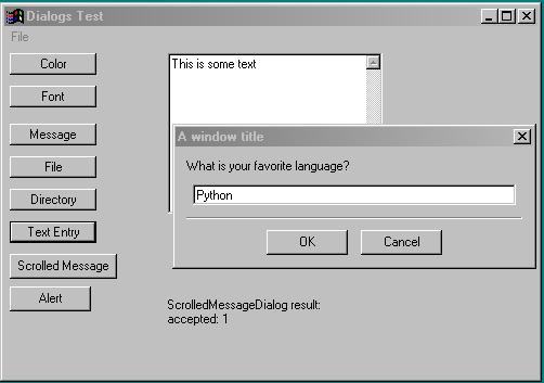
The 'Text Entry' button pops up a dialog which allows you to enter text in a seperate window.
I will leave you to decide when and where this will be useful.
doodle
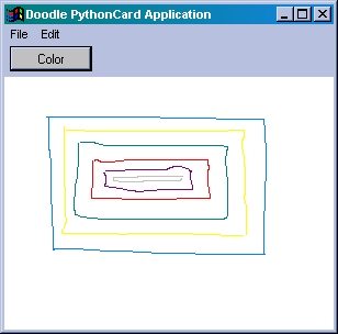
A simple bitmap drawing program.
findfiles

The application when we have performed a search

The 'Browse for Folder' dialogue appears when you press the 'Add Dirs' button
Samples Screen Shots 2
hopalong

This sample plots points using the hopalong algorithm by Barry Martin presented in the September 1986 Scientific American.
minimal

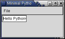
This is about as basic as you can make your application.
For those of us who like to 're-use' code this is a good base to build on.
Add items one by one to this minimal PythonCard app to make it easier to understand what is going on.
proof
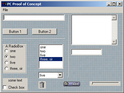
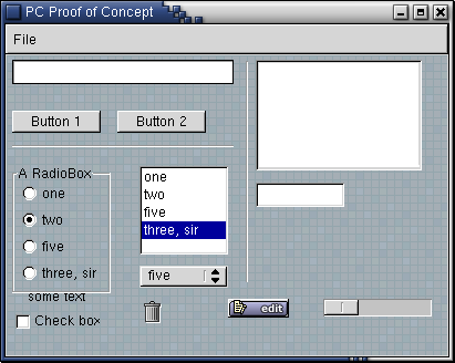
This application implements the proof of concept statement of requirements as specified here.
It is pretty basic but it does show all of the different widget types you can use.
This example also demonstrates the use of an image as a canvas background.
samples
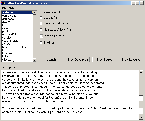
The samples launcher provides a convenient way to try each sample, browse the readme, source code and layout description for each sample.
searchExplorer
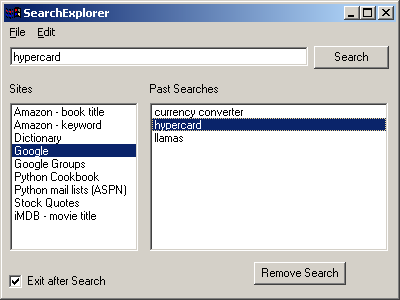
This sample demonstrates just how easy it is to develop quite useful applications using the PythonCard framework.
To use this application, just enter a search string in the first text item, select where you would like to perform the search from the 'Sites' list and then press the 'Search' button.
As you perform searches they are saved in the 'Past Searches' list, a bit like web page URLs in your browser.
To re-run a search select it from the list and press the 'Search' button.
sounds
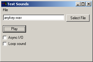
Another really simple but powerful application is this example which will play a sound file.
SourceForgeTracker
SourceForgeTracker downloads XML from SourceForge in order to display Bug
Reports and Feature Requests for a variety of Python SF projects.
textEditor

A basic text editor.
textIndexer

Dan Winkler's original PythonCard test converted from tkinter to PythonCard.
textRouter

TextRouter is a generic weblogging and text "routing" client. It's
main use is for posting to Blogger and/or Manila maintained weblogs. More screen shots are available at
http://simon.kittle.info/stories/storyReader$116. Simon Kittle
maintains a page for TextRouter that includes a standalone binary
installer for Windows.
Noughts and Crosses (tictactoe)

When I was young we used to call this game noughts and crosses.
Some of you may know it as Tic Tac Toe.
The best way to see what this sample application does is to run it.
If anyone would like to write a more advanced algorithm for the computer player then please go ahead.
When you have finished you can post it to the mailing list.
widgets

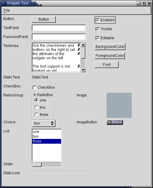
This sample application is designed to demonstrate some of the events that are associated with particular widgets.
The buttons and check boxes on the right hand side of the screen are active and have code associated with them.
Again, the best way to find out what the various controls do is to try them out.
worldclock
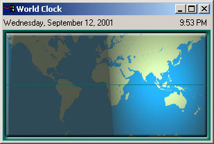
Last, but certainly not least, is the world clock.
A rather natty application that shows you where in the world currently has daylight and where is dark.
You will need to be connected to the internet for this to function properly as the different map images are downloaded from http://www.time.gov/
Can you tell when this screen shot was taken?
Samples Screen Shots Page 3
Here are some pictures of the turtle sample application shipped with PythonCard as it appears on a machine running Windows.
Click on any of the pictures to see a full size version.
This page is dedicated to screen shots from the 'turtle' application. This is a PythonCard alternative to turtle.py from the Python Standard Library.
To download the framework and this application go to the downloads section of the project site on Sourceforge
turtle
This is the result of the default script '4bugs'. Just start the application and select the option "Draw Turtle" from the "File" menu.

Select the "Open File..." option on the "File" menu to see the list of available scripts you can run to generate output.
The rest of the screen shots on this page are produced by running some of these scripts.
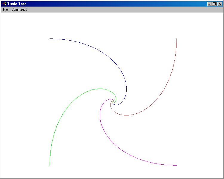
3turtles.txt produces this lovely fractal output. At least I think it is fractal.
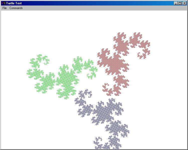
bytedesign.txt produces this output.
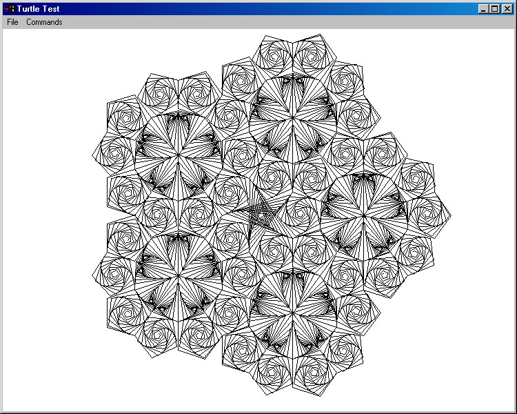
pentest.txt produces this output. This shows the use of colour in 'turtle', as it runs you can see the multiple pens in operation.
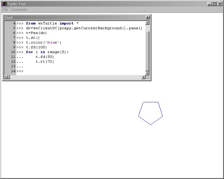
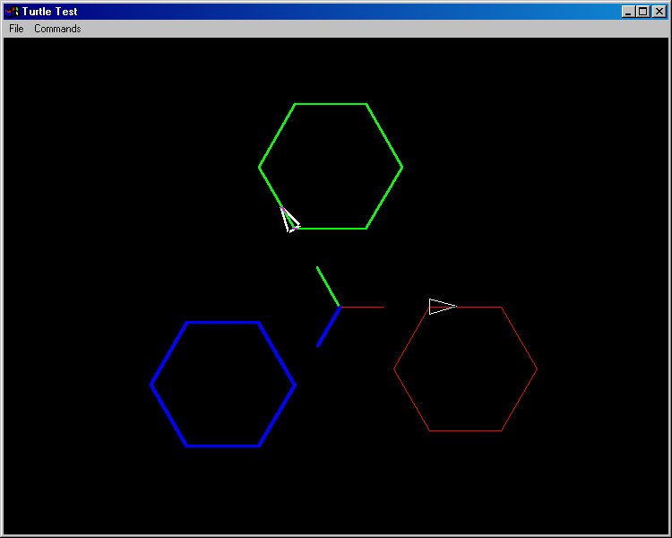
If you read the FAQ included with this sample application (PythonCardPrototype/samples/turtle/docs/FAQ.txt) it gives an interactive example.
Start the application with the '-s' flag and the shell prompt window will open as well.
Type in the example commands and this is the result. Its not complicated, but it is a start. Good luck.
Using the Shell in PythonCard
Version 1.2 of August 2, 2002PythonCard integrates a rich, high-level interactive Python shell. This document describes how to launch and use this shell as you create PythonCard applications. It is based on Version 0.6.5 of PythonCard.
The shell is based on the PyCrust package created by Patrick O'Brien of Orbtech. The release of PyCrust included with wxPython 2.3.2.1 is version 0.7. This document is based on version 0.7.2 of PyCrust in cvs which you can get from SourceForge. This newer version of PyCrust will be included with wxPython 2.3.3, expected out sometime in May. There may be some features or key bindings described below that are not available if you don't have the cvs version of PyCrust.
Overview of Basic Shell Functionality
In many ways, the PythonCard shell resembles IDLE, the Python editor that is included in Python distributions. IDLE is Python's default editor. But the PythonCard shell is more extensive and more robust both in its editing capabilities and in its programming support than IDLE.
As you can see from Figure 1, the shell allows you to do interactive
programming at the standard Python prompt of three angle brackets (">>>").
It behaves like IDLE, so there's nothing new to learn in this respect.

Figure 1. Using PythonCard Shell as Interactive Programming Environment
Pressing Enter anywhere on a line in the shell always processes the command on that line if that line is the last one in the current editing window. Pressing Enter on any other line copies that line's contents and places them on the last line in the window, enabling you to execute the command again or modify it slightly. This feature is quite valuable during testing when you often type the same commands repeatedly. In Figure 2, we positioned the cursor at the end of the line containing the simple statement "5+2" and pressed Enter. Notice that 5+2 now appears as the last line in the editor. Pressing Enter now produces the expected output of "7" on the next line in the editor.


By default, lines typed into the shell do not wrap. If you wish to see the lines in your shell window wrap at the right border of the shell window, type in the shell: shell.SetWrapMode(1). To turn it back off, type shell.SetWrapMode(0).
Key Bindings in the Shell
Table 1 shows all of the key bindings defined in the PythonCard shell and describes their usage.
| Key Combination |
Usage |
| Home |
Go to the beginning of the line |
| Shift + Home |
Select from current cursor position to the beginning
of the line |
| End |
Go to the end of the line |
| Shift + End |
Select from the current cursor position to the end
of the line |
| Alt + Right Arrow |
Move cursor to the right roughly by a word |
| Alt + Left Arrow |
Move cursor to the left roughly by a word |
| Ctrl + C |
Copy the selection to the clipboard |
| Ctrl + Shift + C | Copy the selection including the prompts, if any,
to the clipboard |
| Ctrl + X |
Cut the selection to the clipboard |
| Ctrl + V |
Paste the clipboard contents at the cursor location |
| Ctrl + Shift + V |
Paste the current multi-line clipboard contents
at the cursor location |
| Ctrl + Up Arrow |
Retrieve most recent History item |
| Ctrl + Enter |
Inserts a blank line between existing lines in a
multiline command. |
| Alt + P |
Retrieve most recent History item |
| Ctrl + Down Arrow |
Retrieve next History item in the queue |
| Alt + N |
Retrieve next History item in the queue |
| Shift + Up Arrow |
Retrieve previous History item |
| Shift + Down Arrow |
Retrieve next History item in the queue |
| F8 |
Retrieve a specific History item by typing its first
few characters and then pressing F8 |
Auto-Completion in the Shell
One of the biggest time-saving features built into the PythonCard shell
is auto-completion. Whenever you type a period in identifying a Python
or PythonCard object, method, or property, the shell displays a popup
menu with all of the legal completions to that statement that the shell
knows about. For example, in Figure 4, we imported the standard "os" module
and then typed "os" followed by a period. The popup menu shown in the
figure appears.

- You can keep typing. The popup menu uses incremental search to keep scrolling to the next string that matches what you are typing.
- You can scroll the popup menu with the mouse in the usual way and select the proper completion string.
- You can use the arrow keys to move around inside the popup menu and select the proper completion string.
If the auto-completion menu gets in your way, you can click anywhere outside its boundaries or simply press the ESCape key to close it.
You can turn this auto-completion feature on and off by typing appropriate commands in the shell. To turn the feature on, type in the shell:
shell.autoComplete = 1To turn the feature off, substitute a zero in the above command.
Special Python attributes are prefixed with underscore characters. Some of these attributes use only a single underscore while others use two. You can include or exclude each of these types of attributes in the auto-completion list that appears in the shell by setting two different variables: autoCompleteIncludeSingle and autoCompleteIncludeDouble. For example, to exclude attributes preceded by single underscores from the list, type:
shell.autoCompleteIncludeSingle = 0Similarly, setting autoCompleteIncludeSingle to a value of 1 will include those attributes. The same is true for the autoCompleteIncludeDouble setting.
Python objects include another type of attribute, often referred to as "magic attributes." These attributes' values can only be obtained by calling the object's _getAttributeNames() method, if it has one. You can determine whether these attributes are included in the auto-completion popup by setting the variable autoCompleteIncludeMagic to 1 to include them, 0 to exclude them:
shell.autoCompleteIncludeMagic = 1
Documentation Auto-Display in the Shell
Similarly to the auto-completion popup described in the preceding section,
the PythonCard shell also includes the ability to automatically display
important documentation for any function or method. Simply type the method
or function name and the opening (left) parenthesis and the shell displays
helpful information describing the function. These "call tips" attempt to
display on their first line all of the arguments expected by a callable object.
Where the object involved is the class name, the arguments expected by the
class constructor are displayed. The second line of the call tip displays
the docstring for the object if it has one.
Figure 5 demonstrates this feature. We have typed "os.fdopen(" and the
resulting tool tip tells us the required and optional parameters and
what the function does as well as what it returns.

Editing and Retrieving Functions and Compound Statements in the Shell
You can copy, paste, edit, and execute multi-line functions and compound statements in the PythonCard shell. This can be a huge time-saver when you want to re-execute a method you've defined in the interactive editor. To do so, simply use any of the history retrieval methods outlined in Table 1 to copy any group of multiple lines and then edit them in place. If you, e.g., define a function or class in the shell and you make a mistake, you can avoid the usually mandatory complete re-typing of the code by copying the whole thing and then editing the mistakes. You can also use the PythonCard shell in conjunction with another Python-aware editor. You could, e.g., create a class in another editor, then copy its definition and paste it into the shell to experiment with it. Each time you need a new copy of the class definition, simply paste it again.
You may find yourself occasionally wanting to re-execute multiple
commands , each of which may be a single line or a multi-line command.
In that situation, pasting those lines into the shell using Shift+Ctrl+V
will paste all the lines and run all of the commands contained in the selection.
If you want to copy multi-line commands from the shell into another
file (e.g., for documentation purposes), you can select and then use Ctrl+C
to copy those lines. This will strip the Python shell prompts out of the copied
material. If, however, you wish to retain those prompts, use Shift+Ctrl+C
to perform the copy and the prompts will be preserved when you paste the
selection into another window or file.
$Revision: 1.4 $, documentation updated on $Date: 2002/08/03 18:14:39 $
| General |
| Home page |
| Downloads |
| Mailing list |
| Screenshots |
| Development |
| Project page |
| CVS access |
| Bug Reports |
| Feature Requests |
| Exits |
| PyCrust |
| wxPython |
Building 'standalone' PythonCard ApplicationsIntroductionThis document is targeted at developers who have successfully completed a project based on PythonCard and now wish to distribute their work to a wider audience. The information given here was gathered with reference to PythonCard Version 0.7.2. It is inevitable that some (or all!) of this document will go out of date. If so, please either post a message to the PythonCard users mailing list or send email to phil at linux2000 dot com, and I'll update it. My motivation in writing this document is fairly straightforward. Having got my PIMP application working pretty much the way I wanted it, I needed to look into how to turn it into a single executable, with an easy-to-use install and un-install routine. My ultimate goal was to produce something so straightforward that my mum could install it on her Windows XP computer without any problems. :-) Tools Required - HardwareAs a PythonCard developer, you will already have a computer with Python, wxPython and PythonCard itself already installed. This will be the machine you use for coding and testing your PythonCard applications. This machine will be of no use whatsoever to you in testing your application as a standalone piece of software. The reason for this is precisely because it already has everything installed that is required to run your application. In order to be able to properly test a standalone PythonCard application, you will need access to a machine which explicitly does not have the above installed - you need to be confident that the behaviour you are seeing from your app is because you have packaged it correctly, rather than just being as a result of it being run on a machine with all the necessary components already installed. The only 100% reliable way of doing this is to have a separate machine for testing your application and its installer. I achieved this by using VMWare workstation (http://www.vmware.com) on my Linux PC and setting up 2 'guest' machines, both running Windows XP - one with Python and the other bits installed for doing the development and debugging work, the other set aside purely for testing the results of my work. In the remainder of this document, where I talk about the development machine, I'll be referring to the PC where you do your coding and the building of your standalone application. If you see me talking about the testing machine, I'm referring to the machine that doesn't have Python, etc installed. Tools Required - SoftwareIn addition to the software you already have on your development machine, you will also need to install these packages:
At the time of writing (March 18 2004) the McMillan website has been down for some time. It may or may not come back up again, in the meantime, you can download a copy of McMillan Installer version 5b5 from http://www.linux2000.com/downloads/installer_5b5_5.zip Configuring McMillan InstallerBefore you can do anything useful with the McMillan Installer, it needs to be configured. To do this, click Start --> run and type cmd to open a command line session on your development machine. Type the following commands: cd C:\Python23\Installer Configure.py In the rest of this document, I'll be using my PIMP application as my example of building a standalone. The directory names will therefore reflect the way I personally like to work, your mileage may vary. Specifically, I have a directory C:\Python23\projects\pimp where I do all my coding, and everything else will be relative to this 'root' directory. Generating A 'Spec' File For Your ApplicationThe specification, or 'spec', file is the information used by McMillan Installer to compile and build the standalone version of your application. It's basically a list of the Python source files, Pythoncard resource files and any other stuff that your Pythoncard app needs in order to run properly. To generate the initial spec file, type these commands in a Command Prompt window: cd C:\Python23\Installer
Makespec.py --icon ..\projects\pimp\pixmaps\pimp.ico
--out ..\projects\pimp ..\projects\pimp\pimp.py
You should replace pimp.py with the name of the Python script that corresponds to the main part of your application. The icon file isn't compulsory, but taking the time to select an icon makes your app look a little more polished. You may find at this point that you wind up with an error message saying TypeError: unpack non-sequence. At the time of writing, the jury is still out on whether this is a bug in the Installer or in wxPython. The recommended solution is to comment out the call to RegistryImportDirector() on line 225 of the iu.py file in c:\python23\installer. Do the same on line 251 of the mf.py file and then re-run the Makespec.py command from above. This issue has been reported to Gordon as a bug, you can check the status of this item on the McMillan web site, the URL is http://mcmillan-inc.com/cgi-bin/BTSCGI.py/BTS/editbugs?bugid=73. Thanks to Brent Fentem <bfentem (at) sbcglobal.net> for the fix. At this point, you'll have a basic spec file in your app's root directory, that probably looks something like this:
a = Analysis([os.path.join(HOMEPATH,'support\\_mountzlib.py'),
os.path.join(HOMEPATH,'support\\useUnicode.py'),
'..\\projects\\pimp\\pimp.py'],
pathex=['C:\\Python23\\Installer'])
pyz = PYZ(a.pure)
exe = EXE(pyz,
a.scripts,
exclude_binaries=1,
name='buildpimp/pimp.exe',
debug=0,
strip=0,
upx=0,
console=1 , icon='..\\projects\\pimp\\pixmaps\\pimp.ico')
coll = COLLECT( exe,
a.binaries,
strip=0,
upx=0,
name='distpimp')
The observant reader will have noticed (quite correctly) that this file seems to consist of Python source code! This helps us immensely in simplifying the file contents for ease of maintenance. Firstly add a line at the top of the file to define the root directory for your application, then modify the remainder of the spec file so it looks like this:
p = 'c:/python23/projects/pimp/' # defines project 'root' directory
a = Analysis([os.path.join(HOMEPATH,'support\\_mountzlib.py'),
os.path.join(HOMEPATH,'support\\useUnicode.py'),
p + 'pimp.py'],
pathex=['C:/Python23/Installer'])
pyz = PYZ(a.pure)
exe = EXE(pyz,
a.scripts,
exclude_binaries=1,
name='buildpimp/pimp.exe',
debug=0,
strip=0,
upx=0,
console=1 , icon = p + 'pixmaps/pimp.ico')
coll = COLLECT( exe,
a.binaries + \
[('pimp.rsrc.py', p + 'pimp.rsrc.py', 'DATA')],
strip=0,
upx=0,
name='distpimp')
Go back to your command prompt window, and issue this command: Build.py ..\projects\pimp\pimp.spec The build process should now run to completion with no fatal error messages. You will find 2 new folders have been created in your application root directory. buildpimp is used purely as a temporary work area when (re-)building the app. distpimp is the directory containing the standalone version of your program. It is the contents of this directory which need to be packaged up using Inno Setup and distributed, more on that part of the process later. You should note the line in the spec file containing console=1. This causes your app to be run from a command-prompt style window, allowing you to see any unexpected error messages. When you're happy that the app builds and runs the way you want, you can change this to read console=0. Resolving import errorsThe Installer does its best to analyse your source code to see what modules you've used via Python import statements. For the most part, it does an excellent job, but it needs a little help where the Pythoncard part is concerned. Open a new Command Prompt window and type the following: cd c:\python23\projects\pimp\distpimp pimp The program will now abort with an error message, complaining that it was unable to import some module or other. The precise one will depend on the Pythoncard components that your app uses, the first one mine complained about was statictext. This is where the first bit of tedious source code editing comes in. You need to explicitly import all of the Pythoncard components that your application uses. I did this the lazy way, by adding in each component in turn, rebuilding the standalone and re-running it, until I had no more import errors. The lines I ended up with at the top of my code looked like this: # imports required by mcmillan installer
from PythonCardPrototype.components import statictext, imagebutton, textfield, \
textarea, list, staticbox, checkbox, passwordfield, radiogroup, spinner, \
combobox, choice, htmlwindow, bitmapcanvas
Finalizing the spec fileHaving resolved all the issues with the components, you now need to add all the other parts of your application to the spec file, i.e. the Pythoncard resource files for any child windows, any images used for buttons, documentation files, etc. This is an extremely tedious task, and has already got me thinking about writing a Pythoncard project manager app to do all this stuff automatically...the final version of my spec file looks like this:
p = 'c:/python23/projects/pimp/' # defines project 'root' directory
a = Analysis([os.path.join(HOMEPATH,'support\\_mountzlib.py'),
os.path.join(HOMEPATH,'support\\useUnicode.py'),
p + 'pimp.py'],
pathex=['C:/Python23/Installer'])
pyz = PYZ(a.pure)
exe = EXE(pyz,
a.scripts,
exclude_binaries=1,
name='buildpimp/pimp.exe',
debug=0,
strip=0,
upx=0,
console=1 , icon = p + 'pixmaps/pimp.ico')
coll = COLLECT( exe,
a.binaries + \
[('pimp.rsrc.py', p + 'pimp.rsrc.py', 'DATA')] + \
[('advancedPrefsDialog.rsrc.py', p + 'advancedPrefsDialog.rsrc.py', 'DATA')] + \
[('albumDialog.rsrc.py', p + 'albumDialog.rsrc.py', 'DATA')] + \
[('albumEdit.rsrc.py', p + 'albumEdit.rsrc.py', 'DATA')] + \
[('filterBatch.rsrc.py', p + 'filterBatch.rsrc.py', 'DATA')] + \
[('filterInfo.rsrc.py', p + 'filterInfo.rsrc.py', 'DATA')] + \
[('editFilter.rsrc.py', p + 'editFilter.rsrc.py', 'DATA')] + \
[('helpAbout.rsrc.py', p + 'helpAbout.rsrc.py', 'DATA')] + \
[('imageExportDialog.rsrc.py', p + 'imageExportDialog.rsrc.py', 'DATA')] + \
[('pandlDialog.rsrc.py', p + 'pandlDialog.rsrc.py', 'DATA')] + \
[('passwdDialog.rsrc.py', p + 'passwdDialog.rsrc.py', 'DATA')] + \
[('picPreview.rsrc.py', p + 'picPreview.rsrc.py', 'DATA')] + \
[('prefsDialog.rsrc.py', p + 'prefsDialog.rsrc.py', 'DATA')] + \
[('slideShow.rsrc.py', p + 'slideShow.rsrc.py', 'DATA')] + \
[('changelog.txt', p + 'changelog.txt', 'DATA')] + \
[('readme.txt', p + 'readme.txt', 'DATA')] + \
[('doc/gpl.txt', p + 'doc/gpl.txt', 'DATA')] + \
[('doc/about.html', p + 'doc/about.html', 'DATA')] + \
[('doc/author.html', p + 'doc/author.html', 'DATA')] + \
[('doc/license.html', p + 'doc/license.html', 'DATA')] + \
[('doc/recursion.txt', p + 'doc/recursion.txt', 'DATA')] + \
[('pixmaps/album.png', p + 'pixmaps/album.png', 'DATA')] + \
[('pixmaps/blank.png', p + 'pixmaps/blank.png', 'DATA')] + \
[('pixmaps/camera.png', p + 'pixmaps/camera.png', 'DATA')] + \
[('pixmaps/delete.png', p + 'pixmaps/delete.png', 'DATA')] + \
[('pixmaps/down.png', p + 'pixmaps/down.png', 'DATA')] + \
[('pixmaps/exit.png', p + 'pixmaps/exit.png', 'DATA')] + \
[('pixmaps/export.png', p + 'pixmaps/export.png', 'DATA')] + \
[('pixmaps/filter.png', p + 'pixmaps/filter.png', 'DATA')] + \
[('pixmaps/finepix2800.png', p + 'pixmaps/finepix2800.png', 'DATA')] + \
[('pixmaps/forward.png', p + 'pixmaps/forward.png', 'DATA')] + \
[('pixmaps/fullscreen.png', p + 'pixmaps/fullscreen.png', 'DATA')] + \
[('pixmaps/import.png', p + 'pixmaps/import.png', 'DATA')] + \
[('pixmaps/info.png', p + 'pixmaps/info.png', 'DATA')] + \
[('pixmaps/ledgreen.png', p + 'pixmaps/ledgreen.png', 'DATA')] + \
[('pixmaps/ledred.png', p + 'pixmaps/ledred.png', 'DATA')] + \
[('pixmaps/left.png', p + 'pixmaps/left.png', 'DATA')] + \
[('pixmaps/locations.png', p + 'pixmaps/locations.png', 'DATA')] + \
[('pixmaps/mkalbum.png', p + 'pixmaps/mkalbum.png', 'DATA')] + \
[('pixmaps/new.png', p + 'pixmaps/new.png', 'DATA')] + \
[('pixmaps/nofullscreen.png', p + 'pixmaps/nofullscreen.png', 'DATA')] + \
[('pixmaps/open.png', p + 'pixmaps/open.png', 'DATA')] + \
[('pixmaps/options.png', p + 'pixmaps/options.png', 'DATA')] + \
[('pixmaps/padlock.png', p + 'pixmaps/padlock.png', 'DATA')] + \
[('pixmaps/password-big.png', p + 'pixmaps/password-big.png', 'DATA')] + \
[('pixmaps/password.png', p + 'pixmaps/password.png', 'DATA')] + \
[('pixmaps/pause.png', p + 'pixmaps/pause.png', 'DATA')] + \
[('pixmaps/people.png', p + 'pixmaps/people.png', 'DATA')] + \
[('pixmaps/play.png', p + 'pixmaps/play.png', 'DATA')] + \
[('pixmaps/reverse.png', p + 'pixmaps/reverse.png', 'DATA')] + \
[('pixmaps/right.png', p + 'pixmaps/right.png', 'DATA')] + \
[('pixmaps/rotatecw.png', p + 'pixmaps/rotatecw.png', 'DATA')] + \
[('pixmaps/rotateccw.png', p + 'pixmaps/rotateccw.png', 'DATA')] + \
[('pixmaps/save.png', p + 'pixmaps/save.png', 'DATA')] + \
[('pixmaps/slideshow.png', p + 'pixmaps/slideshow.png', 'DATA')] + \
[('pixmaps/stop.png', p + 'pixmaps/stop.png', 'DATA')] + \
[('pixmaps/up.png', p + 'pixmaps/up.png', 'DATA')] + \
[('pixmaps/view.png', p + 'pixmaps/view.png', 'DATA')] + \
[('themes/default/caption.gif', p + 'themes/default/caption.gif', 'DATA')] + \
[('themes/default/hide.gif', p + 'themes/default/hide.gif', 'DATA')] + \
[('themes/default/notescript.js', p + 'themes/default/notescript.js', 'DATA')] + \
[('themes/default/tech.gif', p + 'themes/default/tech.gif', 'DATA')],
strip=0,
upx=0,
name='distpimp')
You can now rebuild your standalone and check that it runs without any error messages in the console window. The installer generated the standalone version of my app in the ./projects/distpimp on my machine. The folder name will be whatever you called your app with 'dist' on the front. I also found a ./projects/buildpimp directory had been created - according to the installers docs, this is used to store transient files during the build process and can be ignored. Using Inno SetupInno Setup is a lovely piece of software that allows you to package up the contents of a directory into a single .EXE file that can easily be distributed. When someone downloads this and double-clicks, it launches the familiar series of dialogs through which a new program can be installed. It also takes care of adding an item in Control Panel --> Add and remove programs which allows your application to be removed just as easily. Launch Inno Setup, and select the option to Create a new script file using the Script Wizard. Click OK, then Next to launch the wizard. I set the options on the application information section as follows:
Click Next to get to the Application directory section. For most people, the defaults that Inno offers should be okay, but feel free to make amendments if required. Click Next. You'll now see the Application files section. This is probably the most important part of the process, as this is where you tell Inno which specific files to include in the executable. Luckily, if you've done the part with McMillan Installer correctly, everything you need should already be there. Make sure you only include the files that your app really needs - for example, whilst putting this document together, I couldn't work out why PIMP kept having problems after I had installed it on the test machine. It took me a while to figure out that I'd included a pimp.ini file from my development machine in the SETUP.EXE produced by Inno. Taking this out cured the problem! Click Next to get to the Application icons section. You should select whichever options you want the user to have. Click Next. On the Application documentation section, I included a copy of the GPL in text format as the license file, and a copy of the PIMP changelog as the file to display before installation. This leads to the interesting situation of the end user having to agree to the terms of the GPL before being allowed to install the software! Irony is such a wonderful thing... Click Next a couple more times and your SETUP.EXE file will be generated. Inno will put it in a ./Output directory off your main project root folder. You can now copy this file over to your test machine and check that it does actually install and run the way you expect it to. The final task in this section is to ensure you save the Inno Setup script file that you just generated. For the record, my PIMP application generated the following:
; Script generated by the Inno Setup Script Wizard.
; SEE THE DOCUMENTATION FOR DETAILS ON CREATING INNO SETUP SCRIPT FILES!
[Setup]
AppName=PIMP
AppVerName=PIMP 0.7
AppPublisher=Phil Edwards
AppPublisherURL=http://www.linux2000.com/pimp.html
AppSupportURL=http://www.linux2000.com/pimp.html
AppUpdatesURL=http://www.linux2000.com/pimp.html
DefaultDirName={pf}\PIMP
DefaultGroupName=PIMP
AllowNoIcons=yes
LicenseFile=C:\Python23\projects\pimp\distpimp\doc\gpl.txt
InfoBeforeFile=C:\Python23\projects\pimp\distpimp\changelog.txt
[Tasks]
; NOTE: The following entry contains English phrases ("Create a desktop icon"
; and "Additional icons"). You are free to translate them into another language
; if required.
Name: "desktopicon"; Description: "Create a &desktop icon"; GroupDescription: "Additional icons:";
Flags: unchecked
[Files]
Source: "C:\Python23\projects\pimp\distpimp\pimp.exe"; DestDir: "{app}"; Flags: ignoreversion
Source: "C:\Python23\projects\pimp\distpimp\_socket.pyd"; DestDir: "{app}"; Flags: ignoreversion
Source: "C:\Python23\projects\pimp\distpimp\_sre.pyd"; DestDir: "{app}"; Flags: ignoreversion
Source: "C:\Python23\projects\pimp\distpimp\_ssl.pyd"; DestDir: "{app}"; Flags: ignoreversion
Source: "C:\Python23\projects\pimp\distpimp\_winreg.pyd"; DestDir: "{app}"; Flags: ignoreversion
Source: "C:\Python23\projects\pimp\distpimp\advancedPrefsDialog.rsrc.py"; DestDir: "{app}";
Flags: ignoreversion
Source: "C:\Python23\projects\pimp\distpimp\albumDialog.rsrc.py"; DestDir: "{app}";
Flags: ignoreversion
Source: "C:\Python23\projects\pimp\distpimp\albumEdit.rsrc.py"; DestDir: "{app}";
Flags: ignoreversion
Source: "C:\Python23\projects\pimp\distpimp\changelog.txt"; DestDir: "{app}";
Flags: ignoreversion
Source: "C:\Python23\projects\pimp\distpimp\editFilter.rsrc.py"; DestDir: "{app}";
Flags: ignoreversion
Source: "C:\Python23\projects\pimp\distpimp\filterBatch.rsrc.py"; DestDir: "{app}";
Flags: ignoreversion
Source: "C:\Python23\projects\pimp\distpimp\filterInfo.rsrc.py"; DestDir: "{app}";
Flags: ignoreversion
Source: "C:\Python23\projects\pimp\distpimp\helpAbout.rsrc.py"; DestDir: "{app}";
Flags: ignoreversion
Source: "C:\Python23\projects\pimp\distpimp\imageExportDialog.rsrc.py"; DestDir: "{app}";
Flags: ignoreversion
Source: "C:\Python23\projects\pimp\distpimp\pandlDialog.rsrc.py"; DestDir: "{app}";
Flags: ignoreversion
Source: "C:\Python23\projects\pimp\distpimp\passwdDialog.rsrc.py"; DestDir: "{app}";
Flags: ignoreversion
Source: "C:\Python23\projects\pimp\distpimp\picPreview.rsrc.py"; DestDir: "{app}";
Flags: ignoreversion
Source: "C:\Python23\projects\pimp\distpimp\pimp.exe"; DestDir: "{app}";
Flags: ignoreversion
Source: "C:\Python23\projects\pimp\distpimp\pimp.rsrc.py"; DestDir: "{app}";
Flags: ignoreversion
Source: "C:\Python23\projects\pimp\distpimp\prefsDialog.rsrc.py"; DestDir: "{app}";
Flags: ignoreversion
Source: "C:\Python23\projects\pimp\distpimp\pyexpat.pyd"; DestDir: "{app}";
Flags: ignoreversion
Source: "C:\Python23\projects\pimp\distpimp\python23.dll"; DestDir: "{app}";
Flags: ignoreversion
Source: "C:\Python23\projects\pimp\distpimp\pywintypes23.dll"; DestDir: "{app}";
Flags: ignoreversion
Source: "C:\Python23\projects\pimp\distpimp\readme.txt"; DestDir: "{app}";
Flags: ignoreversion
Source: "C:\Python23\projects\pimp\distpimp\slideShow.rsrc.py"; DestDir: "{app}";
Flags: ignoreversion
Source: "C:\Python23\projects\pimp\distpimp\win32api.pyd"; DestDir: "{app}";
Flags: ignoreversion
Source: "C:\Python23\projects\pimp\distpimp\wxmsw24h.dll"; DestDir: "{app}";
Flags: ignoreversion
Source: "C:\Python23\projects\pimp\distpimp\wxPython.helpc.pyd"; DestDir: "{app}";
Flags: ignoreversion
Source: "C:\Python23\projects\pimp\distpimp\wxPython.htmlc.pyd"; DestDir: "{app}";
Flags: ignoreversion
Source: "C:\Python23\projects\pimp\distpimp\wxPython.stc_c.pyd"; DestDir: "{app}";
Flags: ignoreversion
Source: "C:\Python23\projects\pimp\distpimp\wxPython.wxc.pyd"; DestDir: "{app}";
Flags: ignoreversion
Source: "C:\Python23\projects\pimp\distpimp\zlib.pyd"; DestDir: "{app}";
Flags: ignoreversion
Source: "C:\Python23\projects\pimp\distpimp\doc\*"; DestDir: "{app}\doc";
Flags: ignoreversion recursesubdirs
Source: "C:\Python23\projects\pimp\distpimp\pixmaps\*"; DestDir: "{app}\pixmaps";
Flags: ignoreversion recursesubdirs
Source: "C:\Python23\projects\pimp\distpimp\themes\*"; DestDir: "{app}\themes";
Flags: ignoreversion recursesubdirs
; NOTE: Don't use "Flags: ignoreversion" on any shared system files
[Icons]
Name: "{group}\PIMP"; Filename: "{app}\pimp.exe"
Name: "{userdesktop}\PIMP"; Filename: "{app}\pimp.exe"; Tasks: desktopicon
Preparing to distribute the finished appWe're almost ready to send the finished Windows version of PIMP out into the big bad world, but there are still a couple of sharp edges that need rubbing down. Firstly, you will recall that when we built the standalone using McMillan Installer, we set the following options in the pimp.spec file:
exe = EXE(pyz,
a.scripts,
exclude_binaries=1,
name='buildpimp/pimp.exe',
debug=0,
strip=0,
upx=0,
console=1 , icon = p + 'pixmaps/pimp.ico')
^^^^^^^^^
This causes the program to run in a command prompt style window, so we can see any run-time error messages produced. Obviously, the program will look pretty lame if we allow it to run this way on the end-users systems. You need to remember to change the console=1 to read console=0 before doing a final build of your program. Secondly, the output executable will always be called SETUP.EXE, which i think is too generic. I prefer the file to include the name, version number and preferably the build number of the program in question. Open up the pimp.iss file that Inno saved and add the following line to the end of the [Setup] section: OutputBaseFilename=pimp-0.7-1 There doesn't appear to be any way at present to force Inno to take this information from an external file, so you just have to remember to update it manually each time you release a new build of the program. Another job for the vapor-ware Pythoncard project manager, I think! As a final check immediately before releasing a new version of PIMP, I try to remember to go also through the following checklist:
Vaporware alert! PythonCard project managerIn the process of preparing these notes, it's become painfully obvious to me that there's a need for a project manager of some sort to assist with the whole process of managing a PythonCard project from initial coding all the way through to the finished Inno-based installer binary. I've made a start on coding this, see the screenshot below for what the user interface will (maybe) look like: 
I'm grateful for the code that Lawrie Abott originally wrote, which has proven to be the inspiration for this project. It's probably about time I left PIMP alone to fester for a bit, anyway. :-) |
That's all for today, folks!
YOUR MAIN HEADING HERE
$Revision: 1.1 $, documentation updated on $Date: 2002/05/09 18:12:29 $
Increasing
Usefulness:
Talking to program back-ends with Timers and Threads
This walkthrough supplements the excellent existing PythonCard 'Getting Started' walkthroughs by Dan Shafer and David Primmer, and follows on from the 'How to Add a child window' lesson. It's based on techniques taken from the various PythonCard sample programs.
Overview, Scope and Purpose
The purpose of this walkthrough is to empower you to make your PythonCard programs capable of much more meaningful work, by acquainting you with two mechanisms - timers and threads, which can be used for communication between your programs' graphical front-ends and back-ends.
Most of the top-level code you add to the front ends - your PythonCard user interfaces - is event handlers. As with programming with any GUI, event handlers should always complete their job fast, and return promptly, so they don't 'clog up the works'. PythonCard is no exception.
But there will be many cases where you need some real-time functionality - back-end code which runs autonomously of user interface events.
An example of this is programs which communicate in real-time on the Internet, or need to interact in real time with other software on your system (eg monitoring system load).
Timers and Threads are two good mechanisms that allow you to separate your program into:
- Front-End - logic which processes user interaction events
- Back-End - logic which manages non-user-interface aspects of your program, talks to other programs on your system or across the internet, and possibly communicates relevant updates to the user interface.
Timers
You can set up your window class so that an event handler gets triggered at regular intervals - the 'tick of the clock'.This is useful for things like a time display on your window, or polling for some external event (for instance, incoming mail), and dozens of other situations.
Let us now add a timer to the example code you've been writing. This timer will automatically add 10 to the number in the counter field, doing this every 5 seconds.
Firstly, you will need to add an on_openBackground event to your main window. You may have already done this, while experimenting in your learning process during the earlier walkthroughs. But if you haven't yet done so, add the following method code to your Counter class:
print "Window opened"
Not very significant - but do save your file, and run counter.py. You'll see a message on stdout when the window opens.
So far, so good. Nice to know that we can receive an event when the window gets opened. But not very useful yet.
Now, we need to use this openBackground event as an opportunity to set up a timer.
So change the event handler to the following:
self.myTimer = wx.wxTimer(self.components.field1, -1) # create a timer
self.myTimer.Start(5000) # launch timer, to fire every 5000ms (5 seconds)
Here, we're making recourse to the wxPython classes underlying PythonCard. We need to do this because PythonCard doesn't yet have its own timer wrappers. You'll also notice from the self.components.field1 that the timer is being created in respect of the field1 widget. More on this later.
Don't try to run this program yet - it will barf since wx is an unknown symbol - we need to grab it into our namespace. To do this, add to the top of your counter.py program the following:
so that wx is a known symbol.
Now, we have to make sure we can receive an event every time the clock 'ticks'.
While conceptually the timer applies to the window as a whole, there's a weird quirk in wx which requires timers to be associated with specific window widgets. So we'll just appease wx and get on with the job.
To receive the clock tick events, we only have to add another handler.
As per the event handler naming convention, (where widgets' handlers are called on_componentName_event, we'll call this handler on_field1_timer, since timer events get directed to the widget field1, and the event is called timer.
Now, add the following method code into class Counter:
print "Got a timer event"
startValue = int(self.components.field1.text)
endValue = startValue + 10
print "Got a timer event, value is now %d" % endValue
self.components.field1.text = str(endValue)
# uncomment the line below if you've already followed the 'child window' walkthrough
#self.minimalWindow.components.field1.text = str(endValue)
Now, save your counter.py program and run it. You should see the number increasing by 10, every 5 seconds. I don't think I need to say any more here - you've got the basic structure - the rest is now up to your imagination.
You could use timer events to poll for external conditions, but this can get real ugly real fast. So in the next section, we'll explore a nicer and more general way to tie your front end code to back end functionality, using threads.
Threads
Python is beautiful in its support of threads - the ability to split up code into multiple threads of control, just like an operating system does when it gives lots of separate programs a share of the CPU.You can ignore the objections of "Python prudes" who insist that threads are not good programming practice. Sure, threads have their pitfalls, such as deadlocks, race conditions etc, but if you use a bit of common sense, and design intelligently, you can avoid these pitfalls. Also, programming to get around the need for threads can pervert your program logic, kind of like pushing your head down through your body and out your back orifice. Not always a pretty sight :p
What we'll be doing here is adding a background thread to your counter program, which (surprise, surprise) writes values (in this case, counting from 0 in steps of 20) to your counter value.
The first thing you could do is disable the timer you set up in the previous section, by commenting out the self.myTimer.Start(5000) statement in your on_openBackground handler (see above). This will avoid confusion for now, since there won't be a running timer to complicate things.
Now, add to the top of counter.py the following statement:
This will give us access to Python's thread creation/dispatch functions, as well as message queues.
A little theory
I'll keep this short and sweet. Simply, the safest way for threads to communicate with each other is via some kind of synchronised objects. We'll use Python's standard message queues (standard Python module Queue), since it's easy and safe and well supported within Python. When your thread wants to send an event to your user interface code, it will send a message to it, then 'wake up' your user interface so that it receives an idle event. The idle event will check the message queue, and react accordingly.Note - when your window classes have an idle event handler, this handler can get triggered by all sorts of things, particularly when your user interface falls 'idle' - mouse stops moving, button click is finished etc. Within the idle event handler, we need to check our message queue so we know when we need to react to something in the back end.
Threads Walkthrough - Summary of Steps Involved:
- Add a message queue to our Counter class.
- Add your thread code to counter.py, but as a global function, not a class method. This thread will periodically sends messages to our window
- In your on_openBackground handler, launch your
thread and pass it a handle to the message queue.
- Add an idle event handler, which picks up these messages
- Within the idle event handler method, check the message queue and react accordingly
1. Add the message queue
Refer back to the on_openBackground(self, event) handler above, and add the following statement:# Add a message queue
self.msgQueue = Queue.Queue()
This sticks a message queue into our Counter window class, that will be used for communication from the thread backend to the foreground window class.
2. Add a Thread Function
Add the following global function to your counter.py:"""
A little thread we've added
"""
print "myThread: entered"
q = argtuple[0]
print "myThread: starting loop"
x = 10
while 1:
time.sleep(10) # time unit is seconds
print "myThread x=%d" % x
q.put(str(x)) # stick something on message queue
wx.wxWakeUpIdle() # triggers 'idle' handlers
x += 10
3. Launch the Thread
Add the
following lines at the end of your on_openBackground handler:thread.start_new_thread(myThread, (self.msgQueue,))
4. Add an idle event handler
In the thread function above, the operative line is wx.wxWakeUpIdle(). Upon calling that method, wxWindows tells all open windows, Hey, wake up - something's happened you might need to react to! So we need to add a handler to our Counter class to handle idle events, and thus get triggered when we get 'woken up'. So add the following method into your Counter class:print "on_idle entered"
5. Check the message queue and react accordingly
Presently, our 'idle' handler isn't very useful - but if you run counter.py, you'll see it gets triggered every time the program falls idle. So now, we'll make it do what it needs to do - reacting to events from our background thread. Replace the idle handler above with the following:print "on_idle entered"
while not self.msgQueue.empty():
# Handle messages from our thread
msg = self.msgQueue.get()
print "on_idle: msg='%s'" % msg
self.components.field1.text = msg
# uncomment the following if you've followed the 'child window' walkthrough
#self.minimalWindow.components.field1.text = msg
Now, we're all done. Launch your counter.py, and watch as the background thread launches, and periodically sends its messages to the user interface, which displays these on the window.
Conclusion
During this walkthrough, you have explored timers and threads, two easy and powerful ways to interface your user interface classes with the back-end of a program (where the 'real work' happens).Having got a handle on front-end/back-end interactions, via threads and timers, you are now empowered to add some serious functionality to your PythonCard programs.
There is now nothing stopping you from writing any kind of application in PythonCard.
- Create the back-end code as a standalone 'daemon' program (or Windows NT/2k/XP 'service'), which talks via socket connection to the front end.
- Create the front-end code, which operates the user interface
- Put a thread into your front end code which does the socket communication to the daemon, and relays commands/responses/status info between the daemon and the user interface.
So, it's over to you now. Play around with your walkthrough programs and the PythonCard sample programs, raid the Vaults of Parnassus for useful bits of code, and hack to your heart's content.
The only limit is your imagination and (rapidly growing) level of Python skill.
Happy programming!
Copyright (c) 2003 by David McNab, david at rebirthing dot co dot nz.
Please feel free to mirror, copy, translate, upgrade and restribute this page,
as long as you keep up to date with Python and PythonCard,
and credit the original author.
$Revision: 1.1 $, documentation updated on $Date: 2003/02/18 16:33:43 $
Getting Started in PythonCard
This document is designed to help people who are interested in learning and using PythonCard but who are not professional programmers and who do not have deep Python scripting skills to learn their way around the environment and to understand how PythonCard applications get built.
Before You Read This Document
It will be helpful if, before you attempt to follow along with this document, you are sure you've done the following:- Downloaded and installed the latest version of PythonCard for your system
- Confirmed that your installation works by successfully launching and running the application called minimal in the PythonCard samples directory
Some Basic Preparation
This document assumes you are running PythonCard on a Windows machine. If you're on a Linux system, you'll have to adjust some of the instructions to match the directory structure and other differences on your machine. At this writing, PythonCard does not yet run on a Macintosh because it relies on the wxWindows cross-platform GUI library, which is in the process of being ported to the Mac. When that port is complete and we've moved PythonCard to the Mac, we'll undoubtedly add appropriate instructions to this and other tutorial documents.You will also have to have access to a Python-aware editor . The good news is that PythonCard comes with a robust editor called codeEditor. When you install PythonCard, codeEditor appears in the tools sub-directory. We recommend that you make it easy to open your Python source files (all of them, not just the PythonCard source) with this codeEditor. You can set up your Windows system so that it allows you to choose PythonCard's codeEditor as one (or the only) editor with which Python source files can be opened and edited by following these steps:
- Open the Explorer and choose "Folder Options..." under the "Tools" menu
- Click on the "File Types" tab
- Scroll down in the "Registered file types" list and select extension "PY Python File"
- Click on the "Advanced" button. You should be looking at an "Edit File Type" dialog with a list of
- Actions such as Edit and Open. Open is probably in bold since it is the default action usually associated with .py files.
- Click on the "New..." button. You should be looking at a "New Action" dialog
- In the "Action:" field type in a label such as "Edit with PythonCard". This is the label that will show up in the context menu when you right-click on a .py file in the Explorer
- In the "Application used to perform action:" field you need to specify the path to the Python executable as well as the location of the codeEditor.py file. On a Python 2.2.1 installation using the default installer this will look like:
C:\Python22\python.exe C:\Python22\PythonCardPrototype\tools\codeEditor\codeEditor.py
"%1"(Note that the text above is entered on one line; it may appear as two lines in your browser because of wrapping of text.)
Substitute your own paths for the ones above and put quotes (") around the paths with spaces in them, if any. If you don't want a console when codeEditor.py runs, then use pythonw.exe instead of python.exe
- Click "OK." You should now have an "Edit with PythonCard" item in your "Edit File Type" dialog
- Click "OK"
- Click "Close" in the "Folder Options" dialog
- Open a directory in the explorer that contains a .py file, then right-click on the file and choose "Edit with PythonCard" and the file should be opened with codeEditor.py. (If it doesn't work, double-check the steps above.)
- Repeat the process for .pyw files, using the same name and path.
If you're not quite sure what PythonCard is or what kinds of problems it's designed to solve, read this document .
A User's Eye View of PythonCard
Now that you've taken all the necessary preparation steps, let's dig into the PythonCard universe and see what's going on just under the hood.PythonCard is a development environment. It needs an application as a starting point, so you generally start by finding an application that has a lot of what you're looking for and cloning it, renaming some files, and then launching the copied application. We've done that for you for this walk-through; the details of how to start your own application come in a subsequent document in this series. (There is another way to begin your PythonCard project development that involves choosing from a pre-defined template. We won't cover that approach here but it is discussed in the next walkthrough in this series.)
Exploring Some Sample Applications
We'll begin our walk-through of PythonCard by looking at the kinds of things it is designed to do. (Understand, however, that these are pretty skeletal applications designed as samples and starting points, not as commercial applications. You can do far more robust things with PythonCard than might be evident from these simple demonstrations.)
In the directory Python22\Lib\site-packages\PythonCardPrototype\samples you'll find a file called samples.py. Double-click this application icon (or launch it in whatever way you're accustomed to on your system).
In a few moments, you'll see a window open called "PythonCard Samples Launcher." (See Figure 1) This PythonCard application lets you browse through the sample applications included with PythonCard, examine them and run them. It's a sort of nerve center for the sample applications. (On some systems, you may also see an operating system console window when the application launches. You can just minimize this window.)

Figure 1. Screen Shot of PythonCard's Samples Launcher
In the scrolling list of applications, select "minimal." Read the description. Click on the buttons labeled "Show Source" and "Show Resource." None of this means anything to you yet, but you need to know that you can always examine the Python source code for the scripts that run your PythonCard applications as well as the resource file that contains descriptions of the elements that make up its interface. You should also know that every PythonCard application has at least two Python source files. One of them ends in ".rsrc.py." This is where PythonCard stores information about the layout of your application's window, while the logic of the program is stored in the other Python file which does not have the ".rsrc" extension before the ".py" extension. Note that you cannot edit in the Samples Launcher.
OK, click the "Launch" button. In a few moments, you'll see a small window like the one in Figure 2. Now you see why this sample is called "minimal." It's about as small a PythonCard application as you can think of! You can change the text in the editing field and you can drag the window around. Eventually, you'll get tired of all this dazzling functionality and want to close the application. You can either click the close box or choose Exit from the File Menu.

Figure 2. Screen shot of minimal PythonCard application window
Back in the Samples Launcher, select the sample called "dialogs." Again, you can examine source and the resource file if you're so inclined. When you're ready, click the "Launch" button. A window like the one in Figure 3 will appear.

Figure 3. Screen Shot of Dialogs Launcher Application in PythonCard
All of the dialog boxes you can see by clicking on buttons to the left of this window are built into PythonCard. Causing them to appear, and determining what the user selected or did with them, is, as you'll learn in a later walk-through, pretty straight-forward. Click on the "Alert" button. A small dialog appears. Click the "OK" button. Notice that in the Sample Dialogs window, you can see the name of the dialog (AlertDialog), and whether the user accepted or canceled the dialog. You can also see what information the program returned to PythonCard as a result of the user's action. In this case, the user accepted the dialog (i.e., clicked "OK") and the dialog returned "Ok." Unless you have some programming or scripting background, that may not be meaningful, but trust us, it's useful data.
Now try the "Message" dialog. Run it twice, clicking "OK" once and "Cancel" the other time. Notice the differences in the information displayed in the Samples Launcher as a result.
One more and then we'll go have some fun with this stuff. Click on the "File" dialog button. You'll see a standard file-open dialog for your system. You can navigate around, choose from the list at the bottom of the window the file type(s) you want to see listed, and select a file (or cancel). Notice what appears in the Sample Dialogs window when you do these various things.
Changing a PythonCard Application
OK, let's go see what's going on under the hood here. In your PythonCardPrototype\docs directory, locate the folder called "GettingStarted". In that directory is a file called starter1.py. Launch it in the usual way. It is a bare-bones PythonCard application. In fact, it's a copy of the minimal application you ran in the last section.Open the file starter1.py in your Python-aware editor of choice. The Python script is, as you'd expect, brief and to the point. Here's the important part to focus on:
def on_menuFileExit_select(self, event):
pass
Even without understanding Python you can probably tell what this
code snippet does. (That's one of the beauties of Python. It is eminently
readable.) It's what we call an "event handler." It gets activated, or
triggered, by the user causing some event. In this case, the user
selects the File Menu's exit option and we do nothing (we "pass" the action).We're going to change what this menu choice does. You'd never handle an assignment the way we're going to show you here, but our purpose is just to show you how easy it is to fiddle with PythonCard's Python scripts to make things happen the way you want them to happen.
First, select the word "pass". Type in its place the following line:
result = dialog.alertDialog(self,
'It works!', 'Showing Off')
Again, this new line of Python code is readable even if you're not a Python guru yet. Now when the user selects the Exit menu, rather than doing nothing, we'll display an alert dialog titled "Showing Off" that says "It works!"
One more change. We have to make sure our Python script knows how to work with dialogs. Near the top of the file above the comments that explain what's going on is a line that says:
from PythonCardPrototype import model
Change that so it says:
from PythonCardPrototype import dialog, modelSave the code.
IT IS IMPORTANT, if you choose to use a Python editor other than PythonCard's codeEditor, that you not try to run the program from within those editors. Doing so in programs like the IDLE editor that ships with the Python distribution or PythonWin, for example, will have nasty consequences because these editors use a different graphics library from what PythonCard uses.
Double-click the "starter1" application. When the window appears, select the Exit option from the File menu. You'll see a small dialog appear as described above.
Close the application by selecting its window's close box.
Making A Slightly More Interesting Change
Go back to codeEditor. If you didn't close it, starter1.py should still be open for editing. Replace the string 'It works!' in the line we edited earlier so that the line reads: result = dialog.alertDialog(self,
self.components.field1.text, 'Showing Off')
This line is almost identical to the one we just had here, but this one takes its text from the text in a component called "field1." That happens, of course, to be the only field in our little application.
Save the code. Then double-click the "starter1" application to try out the change.
Now when you change the text in the field and select File->Exit, you'll see a dialog box that contains the text you put into the field.
What We've Learned
Not a bad start, right? We've learned how to launch a PythonCard application, something about the kinds of dialog support PythonCard has built in, looked at a couple of sample applications, and then edited some source code not once but twice. In the process we also learned that PythonCard has components (user interface elements) that have programs (or scripts) associated with them. We've learned that there are events in PythonCard and that you can write Python code that tells your application what to do when those events are triggered.What's Next?
In the next installment of this PythonCard walk-through, we'll dig a little more deeply into development. We'll see how we can set up our development environment to provide helpful supporting windows that tell us what's going on in our application. We'll also see how to start and build our own application, using the PythonCard built-in graphic editor, the Resource Editor.We'll be producing more of these walk-through documents on other aspects of PythonCard's use. If you want to stay current with PythonCard and the documentation, you should subscribe to the user mailing list .
Continue on to Walk-Through 2
$Revision: 1.13 $, documentation updated on $Date: 2002/06/29 21:46:19 $
Creating a Complete PythonCard Application from Scratch
by Dan Shafer (pydan@danshafer.com )
Background
This is the second in a series of PythonCard walk-through documents. It assumes you have either read and worked your way through PythonCard Walk-Through No. 1 which teaches you the basics of working in the PythonCard environment or that you already understand those basics.
Purpose and Scope
The purpose of this walk-through is to walk you, step by step, through the process of creating a PythonCard application. By the time you have finished this walk-through, you will:
- understand how PythonCard's GUI building facilities work
- know how to create a starting point for a new PythonCard application
- have a grasp of the basic event-handling architecture that gives PythonCard applications life
- know how to create menus and menu items in PythonCard and to hook those items up to actions
Over the years as I've played with various GUI tools and development environments, I have traditionally created a simple counter application as a way of getting familiar with the tool's basic operation and gaining some nodding acquaintance with its language and architecture/API. When PythonCard appeared in my life courtesy of my old colleague Kevin Altis, I decided that I should do the same. Kevin encouraged me to document my efforts and this is the result.
This document walks you step by step through the process of creating an intentionally simplistic PythonCard application. I don't claim that this is the best way to accomplish this objective, let alone the only one. It just happens to be the way I approached it. At the end of this tutorial, I will make a few observations about other things that I could have done that would make the example more instructive or interesting. Note that this tutorial describes how this process is handled in PythonCardPrototype 0.6.4. Continuing enhancements to the UI, especially in the resourceEditor, will make the process more and more streamlined over time.The Application
This simple application, the finished result of which is shown in Figure 1, consists of three buttons and a text field. The text field holds a numeric value (represented as a string) which is manipulated by the three buttons. The buttons add 1 to the current value displayed in the field, subtract 1 from that field's value, and reset the field's value to 0.

Figure 1. Finished Counter Walk-Through Application
The Application Creation Process
Creating an application in PythonCard begins with the creation of a basic
structure. There are two ways to do this. One is to use the PythonCard
Resource Editor (called resourceEditor.py), start with the basic
empty window, and code from scratch. The other is to copy an existing
application's folder, rename a few basic things, and begin with a
somewhat more complete starting point. I'm taking the latter course
here.
The process in summary
- Run resourceEditor to create or modify an existing application.
- Lay out the application's window in Resource Editor.
- Script the components that will trigger actions (buttons and/or menus)
- Cleaning up artifacts of the copied program. Let's go through those steps with my simple Counter tutorial.
A. Run resourceEditor to modify an existing application.
- Make a copy of the "minimal" project folder in the samples folder of the PythonCard distribution. Put into its own folder called "counter." (The folder name isn't important to PythonCard.)
- Rename "minimal.py" to "counter.py" and "minimal.rsrc.py" to "counter.rsrc.py."
- Launch resourceEditor, which is found in the PythonCard distribution's tools folder
- Open the file counter.rsrc.py in the folder you just created. The window looks identical to the minimal application when it is running, except for the menu bar which remains the resourceEditor's menu bar (since we are running resourceEditor at the moment) rather than the Counter application's menu bar. Figure 2 depicts this start-up situation. resourceEditor is a "live" editor; the application is running while you edit it.

Figure 2. Startup Screen for Walk-Through Counter Application
B. Laying out the window for the counter tutorial application.
- Select the text field containing the words "Hello PythonCard" by clicking anywhere in it.
- In the Property Editor window, select the "text" property in the right-hand list of properties for the field1 Text Field object. Select the words in the field and delete them with the Backspace key.
- Type the number "42" (or some other number; I just happen to be a Douglas Adams fan) into the box.
- Click Update.
- In the Property Editor window, select the "font" property in the right-hand list of properties for the field1 Text Field object. Click on the "Font" button and set the font size to 24. [Note that there is a bug in the GTK version of wxPython 2.3.2.1 that prevents the font from being changed. This will be fixed in the next release of wxPython.]
- Click Update.
- Use the resize handles to shape the field so that the entire value "42" shows. Then position the field near the right edge of the window and approximately centered vertically. (You will probably need to resize the window itself; use the same technique for doing so on your system as you'd use for any window.)
- Select the "editable" property of the Text Field object called field1 and uncheck the checkbox. (By making the field read-only, we avoid the necessity of error-checking that would be required if we let the user enter a value directly into the field.)
- Click Update.
- Select Save from the File menu to save the counter.rsrc.py resource file.
- From the "Components" menu, select "Add Button"
- In the Property Editor window, select the "name" property in the right-hand list of properties for the Button1 Button object. Change the default name to 'incrBtn' (for "increment button")
- Click Update.
- In the Property Editor window, select the "label" property in the right-hand list of properties for the incrBtn Button object. Change the label from 'Button1' to 'Increment'.
- Click Update.
- Position this button in the upper left portion of the window.
- Repeat steps 11-15, but this time change the default 'name' to 'decrBtn' (for "decrement button") and the 'label' from 'Button1' to 'Decrement'. Remember to click the "Update" button in the Property Editor after setting each property.
- Position the Decrement button below the Increment button, approximately in the middle of the window.
- Repeat steps 11-15 one more time. Change the default 'name' to 'resetBtn' and the 'label' to 'Reset'.
- Position the Reset button to the bottom of the vertical row of three buttons.
- Save your work.

Figure 3. Project With Buttons Added
C. Scripting the Buttons
Application scripts are stored in the Python (.py) file that represents the application. In this case, that means they are in the file counter.py.- Using PythonCard's built-in codeEditor or your favorite Python code editor, open the file counter.py. It is a small file with a self-explanatory comment and only one event-handling script right now (which responds to the user selecting Exit from the File menu). codeEditor is found in the tools directory of your PythonCard distribution.
- Position your cursor below the last line of the
on_menuFileExit_select(self, event):handler. - Enter the following script, remembering that Python is white-space-aware so that indentations of lines are significant.
def on_incrBtn_mouseClick(self, event):
startValue = int(self.components.field1.text)
endValue = startValue +
1
self.components.field1.text
= str(endValue)Let's examine this script because the others we will write are all but identical.
The opening line of a PythonCard event handler always starts with the keyword "def" which is standard Python for function and method definition. The next expression in the line starts with the PythonCard keyword "on_" and is followed by the name of the component we are scripting. In this case, it's the Increment Button, whose name is "incrBtn." After another connecting underscore, the last portion of the handler definition line defines the event for which this handler is to be called. All events take the same basic set of parameters as shown above.
The next lines are simple Python for the most part. The first line defines a variable called "startValue" to which we assign the current contents of the field, coerced to an integer so we can perform arithmetic on it. The second line adds one to the value we just retrieved. The third line assigns this new result to the field's text property after coercing it to a string.
- As long as we're in the application's main code file, let's also make our program a little more internally consistent. Change the name of the class we're creating from Minimal to Counter. At the end of the file, replace "Minimal" with "Counter" in the line that begins "app = ". The result should look like Figure 4.

Figure 4. Code Changes in counter.py
- Save your work.
- From the resourceEditor's File menu, select "Run."
- When the Counter application appears, click on the Increment button and watch the displayed value in the text field to confirm that it is incrementing as expected.
- Exit the application.
- Back in your Python Editor, copy the function we just created for the Increment button and paste it under that function, being sure indentation remains correct.
- Edit the new handler to change the name of the button from incrBtn to decrBtn and the '+' sign to a minus (' - ') sign.
- Create a final handler for the Reset button that looks like this:
def on_resetBtn_mouseClick(self, event):
self.components.field1.text
= "0"
Figure 5 shows you what your editor window should look like now.

Figure 5. Editor Showing Final Code Changes
- Save your work and test the application again to be sure it still works.
- Open counter.py in your Python editor if it isn't already open.
- Change the word "class" to "classy" and save the program.
- Run the application as you have been doing. You will probably see a brief console window appear and then disappear. Nothing else happens.
- From the File menu in resourceEditor, choose "Run With Interpreter." This launches your PythonCard application with the Python interpreter in a command console for your system so that you can see what error is being generated.
- You should see a syntax error indicated in the new window. It should be displaying the line where we created the intentional typo. (See Figure 6)

Figure 6. Error Shown in Console Window
- Press Ctrl-Z and Enter to terminate the Python interpreter and close
the console window.
- Go back to the counter.py file and fix the line. Save the file and then re-run the application either from the resourceEditor's File menu or from the command line.
D. Cleaning up artifacts of the original program
We already took care of changing the class name and the runtime invocation name of the application from Minimal to Counter. Now let's change the resource file to reflect the program's new name.In resourceEditor, go to the Edit menu and select "Background Info..." Change the name of the application to "PythonCard Counter" and click OK.
That ends the basic aspect of this second PythonCard walk-through. You now have a finished and working PythonCard application.
Optional Step: Adding a Menu
We'll add one optional step for a program like Counter, one which you may well need to take in any application of even a little greater complexity than this one. We'll add a menu to the application.
- In the resourceEditor, go to the Edit menu and choose "Menu Editor..."
- A dialog box appears (see Figure 7) with the current menu structure displayed on the left. As you can see, the Counter application, which was started from the sample application called minimal., has a single menu with a single menu choice.

Figure 7. Opening Screen of Menu Editor
- Click on the "New Menu" button. You should see a dialog box like the one in Figure 8.

Figure 8. New Menu Item Dialog Box
- In the editing area to the right of the display showing the menu, change the name of the menu to menuCounterMenu and its label to Counter.
- Now click on "New Menu Item" and add a new menu item named "counterMenuIncrement." Make its label "Increment."
- Click on "New Menu Item" again and do the same for new menu items "Decrement" and "Reset." When you're done your work should look something like Figure 9.

Figure 9. Menu Editor With All Menu Items Defined
- Save your application in resourceEditor.
- Open the counter.py Python code file in your Python editor. Add the handler name shown here:
def on_counterMenuIncrement_select(self, event):- Copy the three lines of the function in
on_incrBtn_mouseClickand paste them into the definition of this menu function. (Be sure levels of indentation are consistent.) - Follow the same procedure for hooking up the Decrement and Reset menu options. When you're finished, your code window should look something like Figure 10.

Figure 10. All Menu Items Programmed and Ready to Go
- Save your work.
- Run the application (see Figure 11) and confirm everything works as expected.

Figure 11. Finished Counter Application With Counter Menu
$Revision: 1.9 $, documentation updated on $Date: 2002/06/29 08:03:37 $
How to add a child window (or non-modal dialog)
by David PrimmerThis is the third walkthrough in a series of tutorial-style walkthroughs to help newcomers get started using PythonCard.
Overview, Scope and Purpose
This walkthrough covers PythonCard Version 0.6.7. Since PythonCard
is still very much a prototype, you should expect that things will undoubtedly
evolve over the next few releases of the product before its 1.0 release some
time before the end of 2002.
The first two PythonCard walkthrough tutorials (which can be found, like this one, in the docs/html directory of your PythonCardPrototype installation) have created single-window applications. It is, of course, often necessary to create applications with multiple windows. Adding another background as a child window will allow you to modularize your application. You can allow users to turn on and off windows (by using show()), and you can clean up your user interface and split widgets off into logical groups.
In this walkthrough, we will extend our simple Counter application (the subject of walkthrough2) to add a child window which launches when the application opens, interacts with it, and exhibits some demonstrative behavior when the child window is closed. This walkthrough will make more sense if you've worked through walkthrough2.
Modal vs. Non-modal
There are two types of child windows: those that require the user to stop any other activity and pay attention only to the current window (modal) and windows that allow simultaneous interaction with the main window (non-modal or modeless). The first thing to decide when creating a child window is whether you require the window to be dismissed before the user can continue to work with the main application window. With a modal window, users can choose to cancel, they can respond to a message, or they can set parameters and assign values to content in the active application. An example of a simple modal window is a message box or alert.
You may want your window to stick around while the user is working in another window. The radioclient sample, for example, has a child window that displays a view of the current document as it would be rendered in a Web browser. It's important to decide between modal and non-modal before you begin creating your child window because the standard window type in PythonCard, the background, cannot be modal.
model.Background
This is the standard class definition for a PythonCard app:
class Minimal(model.Background):
One of the most important concepts when dealing with child windows in PythonCard is the background. The background is unique to PythonCard and it basically encapsulates a wxFrame and a wxPanel. Each PythonCard application is a class that derives from model.Background. You can't make a class derived from model.Background modal. That is a wxWindows limitation, not PythonCard. If you want a modal dialog then your class has to be derived from model.CustomDialog. They are similar, but different and the resource format is slightly different as well. dbBrowser, resourceEditor, textEditor, and textRouter all use custom modal dialogs.
Overview of Designing a Child Window
Making a non-modal child window using resourceEditor is simple, following these steps:
- Create a window with resourceEditor. In this walkthrough, we'll do so by starting with the minimal sample and adding features.
- In your main application, import the module you created at step 1 and add code to the main application's startup routine to create an instance of your imported child window class.
- Modify the attributes of the new object, calling its methods and using its components. It is now part of the main application.
Create a stand-alone PythonCard application
Each PythonCard .py file contains a class definition derived from PythonCard's model.Background as well as a stub to instantiate that class. A child window is simply an instantiation of a class from within another application. Tutorials in walkthrough1 and walkthrough2 cover how to create a stand-alone PythonCard application so we won't cover that here.
It is possible that your child window will be interacting with the data in your main application, so there may be limits to how much design can be done independently of your main application. But it is still a good idea to try to separate their functions as much as possible to allow code re-use and to simplify debugging. In the current example, we will use the minimal sample as the basis of our child window while using the counter sample as our main application.
Minimal.py has one control, a text field called 'field1'. We will add a button to minimal.py to reset the value of the field in the main counter application to 0 when it is pressed. We will also connect the buttons in the main counter application to update field1's contents in the child window (minimal.py) to match those of the field in counter's window.
Even though these are relatively trivial interactions, they serve to demonstrate the techniques involved in getting two (or more) windows communicating with one another in a PythonCard application.
Start by creating a new folder to hold your two resource files and your two PythonCard script files. Copy minimal.py, minimal.rsrc.py, counter.py, and counter.rsrc.py from their respective folders in the samples directory into this new folder. You can leave their names the same, though in practice you will generally change the names of files to match the application you are constructing.
Open minimal.rsrc.py in the PythonCard resourceEditor and add a button to it as shown in Figure 1.

Figure 1. Button Added to minimal Sample Window
We'll get back to scripting this button shortly.
Launching the Child Window From the Parent Application
Opening the child window in our main application's code is simply a matter of importing the class and creating an object of that class, attached to the current background.
In addition to the standard imports for Counter, we'll import minimal:
from PythonCardPrototype import model import minimal
Next we'll add an event handler to be executed when the Counter application is started. This handler acts something like autoexec.bat on a PC or .login in a Unix shell. Place an on_openBackground handler right below the class definition. (Placement isn't important but following this convention will make it easier for you to work through and maintain multi-window applications.) Here is the class declaration of our Counter application with on_openBackground added:
class Counter(model.Background):
def on_openBackground(self, event):
and here is the code that we will add to the on_openBackgound method:
self.minimalWindow = model.childWindow(self, minimal.Minimal)
We create a minimal window object uisng the childWindow function and give it the name
minimalWindow by passing two parameters to the function:
the parent window (self), and the background class (minimal.Minimal) we want
to use.
That is all is needed to create a minimal window object, but at this point, it is still hidden and not much good to us.
Communicating With Your Child Window
Continuing in the on_openBackground handler, we make calls to set the position and visibility of the new window:
# override resource position
self.minimalWindow.SetPosition((200, 5))
self.minimalWindow.Show()
We now have a window that is an attribute of our main background, just like any of the menus or buttons that are already a part of Counter.
As constructed before we began this project, the increment and decrement buttons in Counter modify the value of the text field in Counter. To cause the Counter application's buttons to update the text value in the minimal child window minimalWindow, we simply add one more call to update the control in that window as well (the new lines are in bold type):
def on_incrBtn_mouseClick(self, event):
startValue = int(self.components.field1.text)
endValue = startValue + 1
self.components.field1.text = str(endValue)
self.minimalWindow.components.field1.text = str(endValue)
def on_decrBtn_mouseClick(self, event):
startValue = int(self.components.field1.text)
endValue = startValue - 1
self.components.field1.text = str(endValue)
self.minimalWindow.components.field1.text = str(endValue)
Notice that we reference components in the child window by a collection
of objects starting with the main application (self) and then pointing first
to the child window, then to its components property, then to the specific
component, then to the property of that component we wish to change. If we
wanted to execute a method of that component or the background, we would
use a similar construct.
This is obviously very simplistic, (not to mention somewhat redundant coding). Many times, you will be using a child window to modify components or data associated with the parent window. PythonCard is not passing events between windows in this release, but in many cases you can simply call the event handler directly. If you are interested in passing an arbitrary event such as a mouseClick, that will require creating the event and then posting it using wxPostEvent. Custom events are beyond the scope of this tutorial. However, the child window is able to access the parent window directly by traversing up the stack of windows.
For example we can place a control on our child window that updates a control on our main background. Let's connect the Reset Counter button we added to the minimal application above. Add the following code to minimal.py
def on_openBackground(self, event):
self.parent = self.GetParent()
def on_btnReset_mouseClick(self, event):
self.parent.components.field1.text = "0"
When our child window it initialized, it calls GetParent() to get a reference to its parent window, and then stores that reference. We place the code that handles this task in the on_openBackground handler so that the reference is available to all handlers in the application.
You'll notice that the text field on the Counter background is reset to zero but the text field on the Minimal background is not. (This might be a little confusing because both fields are called 'field1'. In a real application, the fields should be named something more descriptive.) At this point, our minimal sample is no longer a stand-alone. If you run Minimal by itself, self.parent is set to None. If you were using the child window in other roles or wanted to make it multi-purpose, you could place the self.GetParent() call in a try...except block.
Closing the Child Window
Your main application window will clean up the child window when your app is closed. If the user has the ability to close the child window before the main window closes (by using the the child's File->Exit menu or by clicking the close box on the window) it's a good idea to just hide the window instead of destroying it. This will allow you to unhide the window without re-initializing it and also permits you to communicate with the window while it is hidden. In the process, you avoid runtime errors that could result from the child window being non-existent as far as the application is concerned.
We do this by overriding the on_close event handler. on_close would normally destroy the window but we change it so it hides the window by calling the Show method with a parameter of zero, hiding the window. Just to make things a little more interesting, we've also added a custom doExit function that sets the counter's field1 to an arbitrary value just to confirm the connection between the two windows visibly:
def doExit(self):
self.parent.components.field1.text = "99"
def on_close(self, event):
self.doExit()
self.Show(0)
def on_menuFileExit_select(self, event):
self.Close()
As the above code shows, the File->Exit menu item just calls the wxPython method Close() to close the window. (This is one of the wxPython events that PythonCard does not yet wrap in its own calls, so we have to make the call directly to the wxPython method.) That is the same as clicking the close box on the window and triggers the close window event, so that on_close is called. We placed the work to be done when the document is closing in the doExit method. In this case it just sets the counter field in the parent to "99".
In addition, in doExit() you could modify some properties of the parent window to keep track of the state of your child window. For example, assuming you have a View menu with an item that hides or unhides your child window, you could use doExit() to check or uncheck the 'View Minimal Window' menu item on the parent. The code would look something like this:
self.parent.menuBar.setChecked('menuViewMinimalWindow', 0)
$Revision: 1.5 $, documentation updated on $Date: 2003/01/28 17:50:22 $